The J-Curve: LEROIS Through the AI Energy Transition, 2009–2035
Daniel Goodwin (with help from Claude Code) | June 2026 | v1.1 (revision draft)
Abstract
The US electricity system is entering its largest sustained demand increase in decades as data-center load scales against a generation fleet that is adding firm capacity slowly. We quantify the consequence for societal energy return using the Lambert et al. (2014) financial-proxy metric — here LEROIS (Lambert EROI Social), which reduces to real GDP divided by national energy expenditure (§5.1) and is empirically associated with measures of economic and institutional function. As Vaclav Smil puts it, "energy is the only universal currency" (Energy and Civilization, 2017). We replicate a US series for 2009–2024 and project 2025–2035 under two scenarios: benign neglect and a nation-scale firm-supply buildout.
The model ingests a bottom-up ledger of 3,283 generation projects and 1,521 data-center facilities, probability-weights it, and feeds the net-energy balance into a price-responsive Lambert calculation with no calibration factor. Both sides of the forward ratio are in real (constant-2025-dollar) terms; because LEROIS is a dimensionless ratio, computed consistently it takes the same value in nominal or real terms, and the projected decline reflects real GDP together with the real price of energy rising faster than the GDP deflator — not the choice of basis (§5.1). The forward model adds three investment terms to the static formula — embodied construction energy in the denominator, a capex crowding-out deduction, and an AI economic value-add in the numerator — each sourced and reported with its uncertainty. The value-add is not asserted: it is the incremental AI power a buildout newly powers (ΔP) times an economic value per kWh (q), with the productivity growth required for any GDP target reported as a threshold against today's observed value rather than a point forecast.
From 14.8 in 2024, LEROIS declines in both scenarios as construction energy and data-center load arrive ahead of new firm supply; the scenarios differ in what is earned back.
- Benign neglect. Under a mainstream consensus growth path (+1.8%/yr real GDP, in line with CBO/IMF long-run projections), do-nothing energy policy takes LEROIS to ~7.5 by 2035 — the level associated with the 2022 European deindustrialization episode — because the supply-demand gap and its price effect dominate the ratio. A downside variant replaces the consensus path with a stress scenario: the qualitative narrative of the companion Base Case paper was integrated into a real-GDP path by an ensemble of large language models (§5.1), under which real GDP falls ~30%, electricity rises toward ~$308/MWh, and LEROIS reaches ~4. We headline the consensus figure because it is the better-anchored of the two; the stress value is an extrapolation below the bottom of the observed threshold range and should be read as "off the anchored scale," not as a level estimate.
- Nation-scale mobilization. A firm-supply buildout (enhanced geothermal, nuclear, and gas + solid-oxide fuel cells; ~1,800 TWh/yr of new firm output by 2035) carries the largest up-front cost and dips to a trough near 8 in 2032, then recovers as cheaper power and AI value-add raise the ratio. At the central productivity assumption it returns to ~13.8 by 2035 (range ~10–20 across the productivity band; ~11 if the AI term is taken on a stricter sector-value-added basis rather than revenue).
Both paths carry the up-front cost of the (largely exogenous) AI buildout, so both descend; only the path that builds firm power earns the value-add that lifts the ratio back. The contrast is conditional — on the buildout proceeding at the stated scale and speed, and on AI delivering economic value at the required rate — and we report both requirements explicitly rather than assuming them. Methodology and data are described in full; feedback is welcome.
1. Introduction
1.1 The Problem: Western LEROIS Has Been Declining
Energy Return on Investment (EROI) measures the ratio of energy delivered to society versus energy expended to obtain it. When EROI is high, a small fraction of total energy output is reinvested in the energy sector, leaving the bulk available for manufacturing, transport, healthcare, education, and defense. When EROI declines, the energy sector consumes an increasing share of economic output, leaving less for everything else. The relationship is non-linear: as EROI drops from 10:1 toward 5:1, the fraction of output consumed by energy extraction doubles from 10% to 20%, and the discretionary surplus available to society shrinks disproportionately. Murphy and Hall (2010) termed this the "net-energy cliff."
Lambert, Hall, Balogh, Gupta, and Arnold (2014) established a financial-proxy method for estimating societal EROI across nations (which we term LEROIS, Lambert EROI Social), finding that quality-of-life indicators — the Human Development Index, health expenditure per capita, female literacy, the Gender Inequality Index, and child nutrition — rise with it and saturate above a societal-EROI band of roughly 20–30:1 on their scale, below which they degrade. (A separate strand of the EROI literature frames a "minimum EROI for civilization" near ~12–14:1, but that is a single-fuel extraction threshold — oil at the well-head — [Hall, Balogh, and Murphy 2009], on a different and lower scale than the societal financial proxy; see §1.4.) We compute societal EROI from Lambert et al.'s definition with a cleaner, unit-invariant aggregation that runs below their published index by a fuel-mix-dependent factor (~1.45×; §1.4, Appendix C). On that basis their quality-of-life band is ~14–21:1 on our scale, and the US stands at 14.81:1 in 2024.
Western LEROIS has declined over the past decade, and the AI demand shock could accelerate that decline. Our replicated Lambert series places US LEROIS at 14.81:1 in 2024 — within the 12–15:1 range we associate with normal industrial functioning (Section 1.4), and below the 15+:1 level of the mid-2010s. The change is gradual rather than a single event; the question this paper addresses is how much the AI energy transition adds to it.
1.2 The AI Energy Demand Shock
Into this already-constrained energy landscape, the AI revolution is arriving as the largest new electricity demand source in decades. Our bottom-up pipeline places US data center electricity consumption at approximately 175 TWh in 2024 (1,521 tracked facilities, loaded at a 0.85 capacity factor reflecting near-continuous AI inference). Industry projections from EPRI, Goldman Sachs, US DOE, McKinsey, and BCG span a range from 290 to 1,050 TWh by 2030 (the DOE-commissioned LBNL estimate runs to 2028), with our bottom-up pipeline analysis suggesting approximately 1,000 TWh. Leopold Aschenbrenner's Situational Awareness projects a single 100 GW training cluster by 2030—run continuously for a year, that one cluster alone would draw 876 TWh.
Figure 1 shows the supply-demand picture.
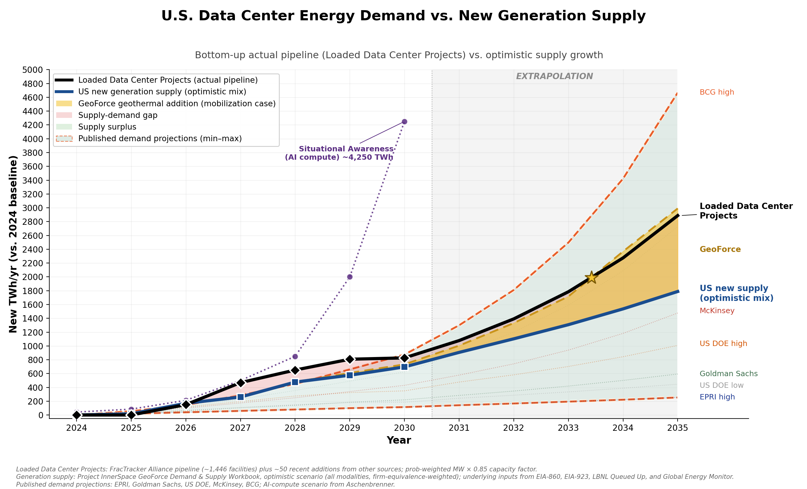
This demand arrives against a backdrop of constrained conventional supply growth. Coal plants are retiring faster than they can be replaced. Nuclear restarts are proceeding slowly. Natural gas expansion faces permitting barriers averaging 4.5 years for major projects. Wind and solar, while growing rapidly in nameplate capacity, contribute firm-equivalent power at only 20–30% of their rated output due to intermittency and limited storage. Net new firm-equivalent supply from the entire US generation portfolio is modest—roughly 18 TWh added in 2025, rising to 150–250 TWh per year later in the decade—while data center demand alone grows by 150–600 TWh per year over the same period. Supply grows; it simply cannot grow fast enough.
The result is a widening gap between electricity supply and demand that drives energy prices higher, shifts the fuel mix toward more expensive marginal sources, and—through the Lambert formula—pushes LEROIS downward.
1.3 The J-Curve Hypothesis
We propose that the AI energy transition will produce a characteristic J-Curve in LEROIS:
-
Descent phase (2025–2031): LEROIS falls as massive construction energy is invested in new generation capacity, data center infrastructure absorbs grid supply, and scarcity drives energy prices upward—while real GDP itself sags under the decade's macro shocks. The energy sector consumes an increasing share of output, directly depressing the Lambert ratio.
-
Trough (~2032): The point of maximum pain, where net energy on the grid is most negative and prices peak. The depth and timing of the trough depend on the scale and speed of the buildout.
-
Recovery phase (2032–2035+): New capacity comes online, supply catches up with demand, prices moderate, and the economic value of powered AI lifts the numerator—so LEROIS recovers. Whether recovery occurs within the projection window—and whether it returns LEROIS above the 12:1 industrial/economic-functioning threshold—depends on the scale of intervention.
This is structurally an investment curve: energy and capital are spent now to be earned back later. The risk is that the trough is deep enough, or lasts long enough, to impose lasting economic damage before recovery arrives.
1.4 The LEROIS Metric
We adopt the notation LEROIS (Lambert EROI Social) to distinguish the Lambert et al. financial-proxy method from other EROI variants in the literature (Hall et al.'s bottom-up EROI, Brockway et al.'s exergy-based estimates, Cleveland's primary-stage EROI). The Lambert method uses macroeconomic variables—GDP, total primary energy supply, end-user delivered prices, and fuel mix shares—to compute a top-down societal EROI that captures the full cost of energy to the economy.
The metric is more transparent than its name suggests. As derived in §5.1, the Lambert formula telescopes to a single ratio: LEROIS is the inverse of the fraction of GDP a nation spends on delivered energy (US 2024: LEROIS 14.8 ↔ energy ≈ 6.8% of GDP, matching the observed ~6.5%). The reader should hold that identity in mind throughout: every projection in this paper is, at bottom, a projection of energy's share of national output, and the 2022 European thresholds are observed records of what advanced economies look like when that share spikes toward 12–15%.
Reconciling our scale with Lambert's. Our directly-computed series runs below Lambert's published societal-EROI values — for the US, by roughly half — and the reason is the aggregation step, not the underlying data or a missing energy term. Lambert's formula forms a ratio of two energy-weighted sums (mean energy content over mean price); we compute the weighted average of each fuel's delivered cost per MJ. A ratio of means is not the mean of ratios — the two coincide only if every fuel had the same energy density, and they differ by four orders of magnitude (3.6 MJ/kWh electricity vs 24,000 MJ/tonne coal). Applied to our own US data year by year, Lambert's form runs 1.3–1.6× higher (mean ≈1.45×), the gap shrinking over time as coal — the fuel their form most over-weights — leaves the mix (Appendix C, Figure C1). We use the per-unit form because it is unit-invariant and telescopes to the quantity above, 1/(energy's share of GDP), which we can validate directly: 1/LEROIS equals 5.8–8.7% over 2009–2024 and tracks the EIA series for US energy expenditures as a share of GDP (Figure C1). Ours is therefore the better-anchored estimator; Lambert's published thresholds rescale onto our scale by dividing by ≈1.45.
Rather than calibrate, we use our raw (direct) values throughout this paper. They are internally consistent, fully transparent, and reproducible from public data. We then derive our own empirical thresholds from observed macroeconomic outcomes rather than adopting Lambert's original thresholds verbatim. The 2022 European energy crisis provides an ideal natural experiment: Germany's LEROIS of 7.29 on our scale coincided with active deindustrialization (BASF closures); the UK at 8.43 required £40 billion in emergency energy subsidies and saw pension fund near-collapse; France at 6.79 experienced fiscal stress and social unrest; the US at 12.72 experienced 9% inflation but no structural breakdown. From these observations we derive empirically-grounded thresholds on our scale (see Section 5.1).
These thresholds are indicative bands, not precise cutoffs. They rest on a small cross-section — a handful of countries in a single year (2022) during an acute price shock — so they map LEROIS levels to outcomes only approximately, and a sustained level may not carry the same consequences as a sudden move to it. The metric's level is also most reliable when delivered prices reflect market-clearing costs: where a price cap or large import dependence distorts the price or energy-intensity terms, the computed LEROIS can overstate the true position (Appendix B documents this for the UK). The band values are themselves fuzzy: societal-EROI estimates shift with the price and energy-accounting conventions used (our own per-unit form runs ~1.45× below Lambert et al.'s ratio-of-sums; §5.1, Appendix C), and the originators of the minimum-EROI hierarchy explicitly label its upper tiers "increasingly speculative" (Lambert et al. 2012). What is robust is the ordering — higher LEROIS means more discretionary surplus — and the direction of travel, not the exact band edges. We therefore treat the thresholds as reference points for interpreting the projected trajectory, not as hard predictions, and report the forward results on a basis comparable to how the thresholds were measured (§5.1).
2. Results
2.1 Historical LEROIS Trajectory (2009–2024)
Our replicated Lambert series shows US LEROIS oscillating within a band of 11.55–17.21:1 over the 16-year historical period, with a mean of approximately 14.1:1.
| Year | LEROIS | Notable Events |
|---|---|---|
| 2009 | 13.81 | Post-financial crisis; energy prices depressed |
| 2011 | 11.55 | Series minimum; high oil prices ($107/bbl Brent) |
| 2015 | 16.00 | Oil price collapse; shale revolution lowers costs |
| 2016 | 17.21 | Series maximum; peak energy surplus |
| 2020 | 16.40 | COVID demand destruction lowers prices |
| 2022 | 12.72 | Post-Ukraine price shock; European energy crisis |
| 2024 | 14.81 | Current baseline; industrial/economic functioning |
The series shows LEROIS's sensitivity to energy prices: the 2015–2016 peak coincides with the oil-price collapse that lowered delivered energy costs, and the 2022 dip with the post-Ukraine shock. The 2022 episode is the basis for our threshold calibration (§1.4, §2.6): at LEROIS 7–8.5 on our scale, several European economies saw deindustrialization and fiscal stress, while the US at 12.72 saw 9% inflation but no structural breakdown.
2.2 The J-Curve: LEROIS Projections Through 2035
Figure 2 presents the central result of this paper: the projected trajectory of US LEROIS under the two scenarios, overlaid on the historical series.
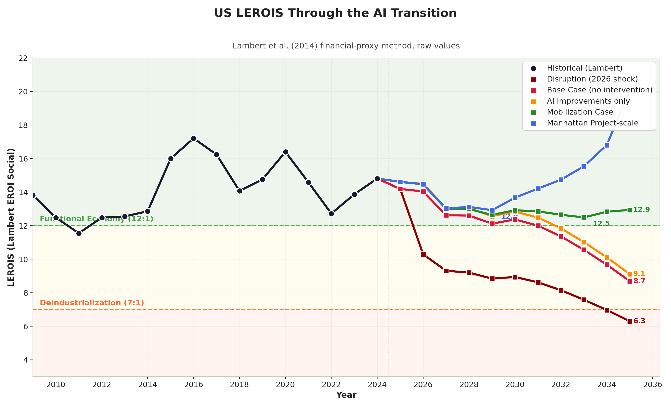
The two paths diverge after the shared descent:
Base Case — benign neglect (red): Only announced and permitted projects, probability-weighted by development status; no accelerated deployment. The headline figure uses a mainstream consensus growth path (+1.8%/yr real GDP, in line with CBO/IMF long-run projections): even with GDP growing normally, the widening supply-demand gap and its price effect take LEROIS to ~7.5 by 2035 (~11.3 at 2030) — the band in which Germany entered active deindustrialization in 2022. The decline, in other words, does not require any economic-collapse assumption: it is driven by energy prices rising toward ~$308/MWh as the gap widens. A stress-GDP variant replaces the consensus path with a downside scenario built from the companion Base Case paper — a Taiwan/chip shock, capital flight, interest costs overtaking growth, entitlement-trust depletion — integrated into a single real-GDP path by an LLM ensemble (§5.1; a stress scenario, not a forecast). On that variant real GDP falls ~30% and LEROIS reaches 4.3 by 2035 — below every European benchmark from 2022, and thus an extrapolation past the bottom of our observed threshold range (France, 6.79), where the level-to-outcome mapping is no longer anchored to data. Cumulative net-energy deficit (common to both GDP paths): −6,273 TWh; the gap does not close within the window.
Nation-scale mobilization (blue): An accelerated buildout across three firm levers — enhanced geothermal ramping to ~800 TWh/yr (~100 GW), nuclear to ~500 TWh/yr (~63 GW; SMR factory production plus restarts and large new build), and ~500 TWh/yr of gas + solid-oxide fuel cells (~82 GW) — roughly 1,800 TWh/yr of new firm output by 2035, enough to close the demand gap. Because it builds the most, it pays the most up front: LEROIS dips to a trough of 8.21 in 2032 (≈8.6 on the threshold-comparable basis of §5.1) as embodied construction energy and not-yet-productive capital are charged before delivery. It then recovers to 13.8 by 2035 — at or just above the 12:1 industrial/economic-functioning band, though only ~11 if the AI value-add is taken on a stricter sector-value-added basis rather than revenue (§5.1). The recovery has two drivers. First, new supply brings electricity from a peak near $191/MWh (2029) down to ~$114/MWh (2035), returning the price term to roughly its 2024 level. Second, and larger, the AI compute that power runs produces economic value that lifts the GDP numerator. The second driver is the uncertain one, so we report it as a sensitivity band in g_Q, the annual growth in economic value per kWh of AI compute: the 2035 outcome ranges from 10.7 (g_Q = 25%/yr) to 19.7 (45%/yr); the central line (13.8) sits at the band's central g_Q of 35%/yr, while restoring the full ~2%/yr real-GDP trend would take g_Q ≈ 37%/yr (§5.1). The mobilization path's cumulative net-energy deficit (−1,475 TWh) is the smallest of the scenarios, and annual net energy turns positive in 2033. Fusion is excluded from delivery (Pacific Fusion and peers target a net-power demonstration around 2030, not a plant). A conservative half-speed-ramp variant does not recover within the window (6.0 by 2035), indicating that the speed of the buildout, not only its eventual scale, determines whether the curve turns.
2.3 The 100 GW Compute Threshold (interpretive context)
This subsection sets the energy results against a widely cited capability milestone; it is interpretive context, not a modeled result. A 100 GW dedicated compute cluster is the approximate power requirement for what Amodei (2024) calls the "country of geniuses in a datacenter." At a 0.85 capacity factor, 100 GW draws approximately 745 TWh annually — roughly 17% of current US electricity generation.
Among the modeled scenarios, only the nation-scale mobilization supplies enough firm power to run compute on that scale within the window: its annual net energy balance turns positive in 2033 and its cumulative deficit (−1,475 TWh) is the smallest of any path, and even then only late in the decade. Under the Base Case, 100 GW of data-center capacity may be announced by 2030 but is not powered: net energy does not recover.
The strategic framing usually attached to this milestone — that the capacity to deploy frontier-scale compute is a determinant of national position, and that China is expanding generation capacity far faster than the US — in 2024 alone it added more solar capacity (277 GW) than the US has installed in total (121 GW) — is the motivation several authors give for treating the buildout as a priority (Amodei; Aschenbrenner). We note it as context; the quantitative results in this paper do not depend on it. We deliberately avoid resting any argument on cross-country LEROIS level comparisons (e.g., China's 8.79 versus the US 14.81 on our scale): as Appendix C shows, the metric's level is not comparable across countries — the aggregation factor depends on each nation's fuel mix, and administered prices distort the level (China's prices, the same way Appendix B documents for the UK's price cap). Within-country trajectories, which all results in this paper rest on, do not suffer this problem.
2.4 The Supply-Demand Gap
The driver of LEROIS decline is the widening gap between electricity supply growth and data center demand growth. Figure 3 shows the net energy added to the grid per year under each scenario.
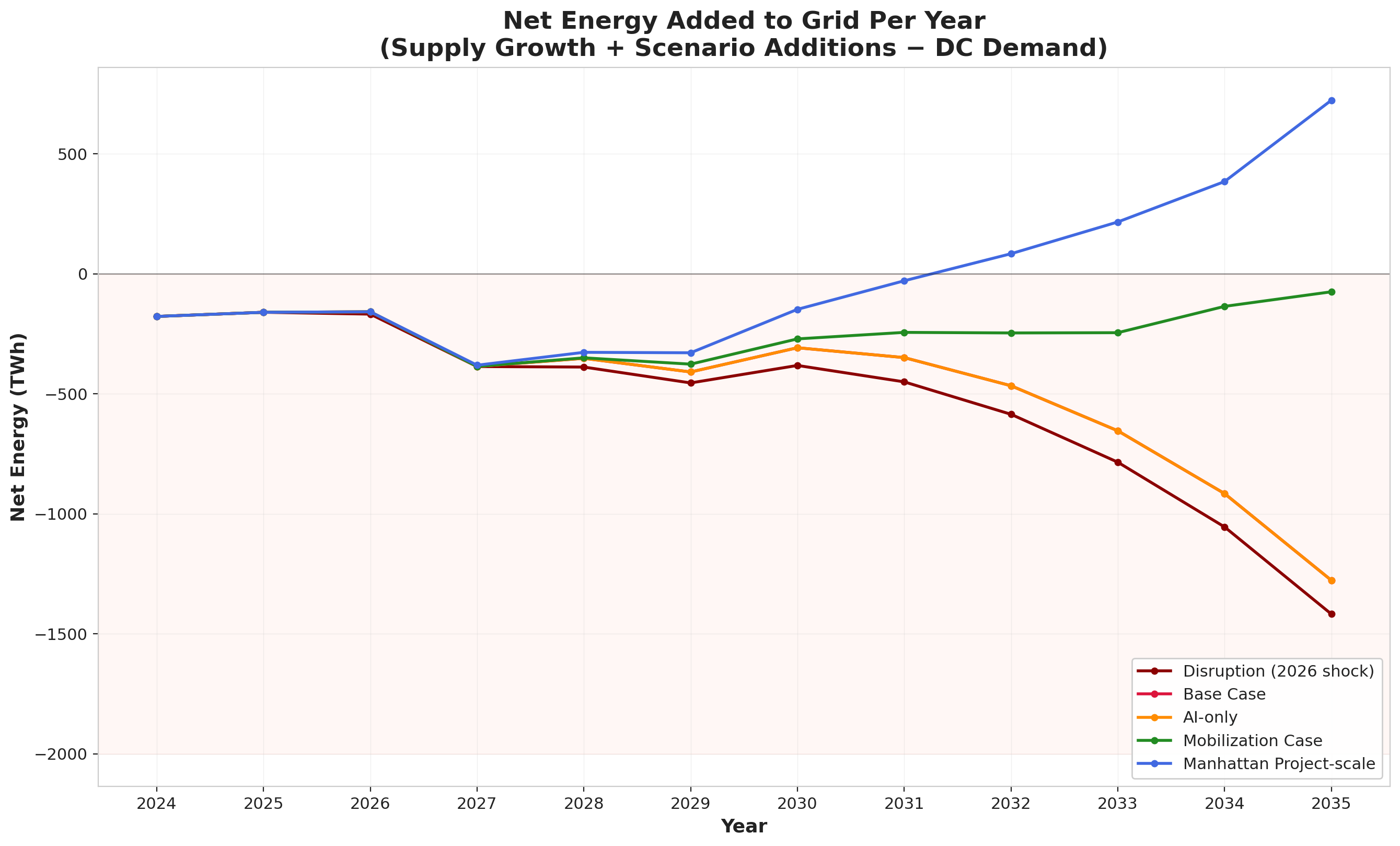
Both paths begin net-negative in 2024–2026, as data center demand growth outpaces new generation. They diverge from 2027 onward:
- Nation-scale mobilization crosses into positive annual net energy in 2033, driven by the combined output of geothermal at scale, nuclear, and gas/SOFC—ending with by far the smallest cumulative deficit (-1,475 TWh)
- The Base Case never recovers, reaching a cumulative deficit of -6,273 TWh by 2035; even a conservative half-speed buildout still falls well short (-3,315 TWh), its annual balance never turning positive within the window
2.5 Energy Price Trajectories
The supply-demand gap translates directly into energy prices through basic supply-demand economics. Figure 4 shows projected price trajectories.
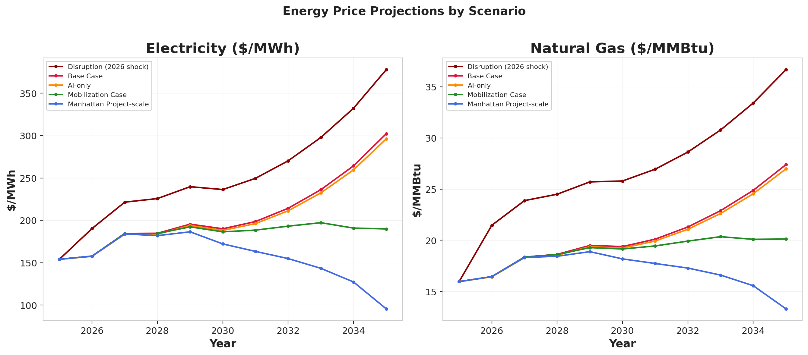
Price dynamics differ markedly between the two paths:
- Nation-scale mobilization: Electricity peaks at ~$191/MWh around 2027–2029, then falls to ~$114/MWh by 2035 as massive new supply (~1,800 TWh/yr) floods the market
- Base Case: Electricity rises continuously from $154/MWh (2025) to ~$308/MWh (2035) as the supply-demand gap widens
These prices emerge from a supply-demand elasticity model calibrated to historical price sensitivity (short-run elasticity of -0.3, GDP-energy price sensitivity of -3% GDP per 100% energy price increase), bounded by observed crisis peaks. Prices are held in real (constant-2025-dollar) terms, consistent with the real-GDP numerator.
2.6 Cross-Scenario Summary
Table 1 summarizes the key metrics across all scenarios, ordered best to worst by 2035 outcome.
Table 1. Cross-Scenario Comparison
| Scenario | Trough Year | Trough LEROIS | 2030 LEROIS | 2035 LEROIS | Cumulative Deficit (TWh) | 100 GW Powered? |
|---|---|---|---|---|---|---|
| Nation-scale mobilization (central) | 2032 | 8.21 | 8.77 | 13.75 | -1,475 | ~2033 |
| — AI-productivity band (low–high) | 2032 | 7.9–8.6 | — | 10.7–19.7 | — | — |
| Nation-scale mobilization (conservative supply) | 2035 | 6.00 | 8.63 | 6.00 | -3,315 | No |
| Base Case (consensus GDP, headline) | 2035 | 7.53 | 11.3 | 7.53 | -6,273 | No |
| Base Case (stress-GDP variant) | 2035 | 4.27 | 8.30 | 4.27 | -6,273 | No |
The central mobilization line carries an AI-productivity sensitivity band of 10.7–19.7 at 2035 (across g_Q = 25–45%/yr growth in AI value per kWh; see §5.1); the central value (13.8) sits at the band's central g_Q (35%/yr); restoring the full ~2%/yr real-GDP trend would take g_Q ≈ 37%/yr (§5.1). A second, independent uncertainty is whether the AI term is read as revenue or as value-added: on a sector-value-added basis the central 2035 figure is ~11 rather than 13.8 (§5.1). The conservative-supply row assumes a half-speed manufacturing ramp and does not recover within the window (6.0 by 2035). The two Base Case rows share an identical energy ledger and differ only in the GDP numerator: the consensus row (headline) shows the decline that energy dynamics alone produce; the stress row shows the compounding when the downside macro narrative is layered on. Both paths share the up-front cost — the embodied energy and capex of the (largely exogenous) AI buildout — which is why even the Base Case dips; only the path that builds firm power, and thereby powers the AI returns, earns a recovery.
Basis note. The LEROIS values in Table 1 include the capex crowding-out deduction in the numerator (a discretionary-surplus reading; §5.1). The 2022 European thresholds below were measured on headline GDP, without such a deduction. On that comparable (headline-GDP) basis the mobilization path troughs at ≈8.6 (vs 8.21 here) and recovers to ≈14.3 (vs 13.8), and the Base Case reaches ≈4.3 (vs 4.27) — so the surplus-basis figures reported here are the more conservative of the two at the trough. The gap is small (≈0.3–0.8 points) because the deduction is a single-digit-percent share of GDP.
The threshold markers are empirical anchors — observed outcomes for advanced economies at measured LEROIS levels during the 2022 European energy crisis — subject to the small-sample limits noted in Section 1.4:
| LEROIS Range | Empirical Basis | Observed Conditions |
|---|---|---|
| >15:1 | US 2015–16 (16–17) | Low energy cost pressure, comfortable surplus |
| 12–15:1 | US most years, UK/DE non-crisis | Industrial/economic functioning, normal operations |
| 10–12:1 | US 2022 (12.72) | 9% inflation, cost-of-living pressure, but no structural breakdown |
| 8–10:1 | UK 2022 (8.43) | Pension fund crisis, £40B energy subsidies, 11% inflation |
| 7–8:1 | Germany 2022 (7.29) | Active deindustrialization: BASF closures |
| <7:1 | France 2022 (6.79) | Fiscal stress, social unrest, industrial strain |
3. Discussion
3.1 The Structural Nature of the J-Curve
The J-Curve is not a modeling artifact—it is a structural consequence of the physics of energy transitions. Building new energy infrastructure requires energy. A nuclear plant consumes energy during construction (steel, concrete, transport, assembly) before it generates any. An enhanced geothermal well requires drilling energy before it produces heat. Even a solar farm requires embodied energy in silicon purification, panel manufacturing, and grid interconnection before its first megawatt-hour.
During a transition, society is simultaneously:
- Consuming energy from existing sources at declining EROI (as conventional reserves deplete)
- Investing energy in new sources that have not yet begun producing
- Paying higher prices for marginal supply as demand outstrips available generation
The Lambert formula captures all three effects: construction energy increases E_T (total primary energy supply, the denominator), scarcity raises prices (increasing the weighted price-per-MJ term), and energy diverted to construction reduces the surplus available for GDP-generating activity (depressing the numerator).
The curve resolves only when new capacity delivers enough energy, at low enough cost, to reverse all three effects together. This is why the speed of the buildout matters as much as its ultimate scale: a slow transition means a longer time in the trough, and the longer the trough, the greater the risk of lasting economic damage.
3.2 Why AI Efficiency Alone Is Insufficient
It is worth asking whether AI's own efficiency and productivity gains could close the gap without a supply buildout. There are credible, quantified pathways by which AI improves every component of the Lambert formula:
GDP productivity: Goldman Sachs (2023) estimates generative AI could raise global GDP by 7%. McKinsey (2023) projects $2.6–4.4 trillion in annual value. Acemoglu (2024) is far more conservative: at most a ~0.66% TFP gain over 10 years, with his preferred estimate below 0.53%. These gains enter the LEROIS numerator directly.
Energy efficiency: Google DeepMind's data center cooling AI reduced cooling energy by 40%. Scaled to the national building stock, similar systems could reduce total commercial building energy by 10–15%. DOE-documented voltage/VAR optimization yields ~2–4% distribution energy savings in field deployments. US transmission and distribution losses run roughly 5% of generation (~190–205 TWh/yr); AI-optimized dispatch could recover a portion.
Accelerated deployment: AI-driven permitting (automated environmental review, optimized site selection) could reduce project timelines by 1–2 years. AI materials science (Google DeepMind's GNoME: 2.2 million new stable crystal structures discovered in 2023) accelerates next-generation battery, solar cell, and superconductor development.
Fuel mix optimization: AI can shift industrial loads to off-peak hours, optimize renewable dispatch, and reduce curtailment. Curtailment in major US ISOs has reached roughly 5–9% of available wind and solar generation in recent years; AI-optimized dispatch could recover 10–15 TWh/yr.
Yet none of this closes the gap on its own. The efficiency gains operate on the margin while the demand shock operates on the base: a 3% reduction in building energy saves ~10 TWh/yr, while data center demand grows 100–200 TWh/yr—an order of magnitude larger. And the productivity return that could lift the LEROIS numerator is itself power-gated: AI delivers economic value only to the extent it is actually powered, so without a supply buildout the compute is starved and the return never materializes. This is why the Base Case does not recover even though its GDP path already lets AI exist — a world with AI but without the power to run it at scale gets the costs without the returns (§2.2). Efficiency gains cannot substitute for the energy to run AI at scale.
Implication: AI does not close the energy gap it creates through efficiency alone. Supply-side capacity is required, and it is also what unlocks AI's economic return in the model.
3.3 Working Backwards from the Gap: Three Supply Levers
Sections 2.2–2.5 build the scenario from the supply side forward. It is worth running the logic in reverse: holding fixed the gap that must be closed, what would each major supply lever have to deliver, and is that physically possible? Working from the supply-and-demand workbook, the firm-capacity gap—total demand growth net of the bottom-up generation pipeline, expressed as continuous capacity—reaches roughly 195–240 GW by 2035 in the base case (~1,329 TWh/yr of unmet demand), and—decisively—it opens fast, reaching ~40–55 GW as early as 2027. Closing a gap of that size and speed with dispatchable, high-EROI generation rather than intermittent nameplate narrows the candidate technologies to three: enhanced geothermal, nuclear, and gas + solid-oxide fuel cells. The mobilization case splits the gap across all three so no single lever has to carry it alone: enhanced geothermal carries the largest deployable share (~100 GW), gas + SOFC the fast bridge that keeps growing (~80 GW), and nuclear a deliberately modest slice (~60 GW) kept within credible bounds. We take each in turn, then ask what is left for AI to do. The exercise yields a clear conclusion: no single lever closes the gap, the near-term gap cannot be closed by new supply at all, and even this balanced buildout depends on AI contributing on three margins—demand, productivity, and the speed of deployment.
Lever 1 — Gas + SOFC: the fast bridge. Combined-cycle gas is the default firm resource, counted at full firm-equivalence (1.0). The constraint is not the resource or even permitting—it is that turbines cannot be ordered fast enough. The US added just 0.1 GW of new combined-cycle capacity in 2024, with roughly 3 GW/yr planned through 2027. Manufacturing is the bottleneck: GE Vernova's gas-turbine backlog now stretches deliveries into 2029, with the company expecting to be "sold out through 2030," while Siemens Energy carries a record ~€138 billion order backlog—roughly 60% of its gas orders tied to US data centers—and lead times for a new heavy-duty turbine have stretched from ~3 to 5–7 years. Gas turbines therefore supply a meaningful but OEM-throughput-capped tranche (~40 GW / ~200 TWh/yr by 2035, roughly extrapolating today's build rate). What raises this lever is solid-oxide fuel cells (SOFC)—a distinct, faster-scaling complement that deploys behind the meter in months, not years, at high capacity factor. Bloom Energy is doubling production to ~2 GW/yr by end-2026, Oracle has contracted up to 2.8 GW of Bloom (1.2 GW underway), and Goldman Sachs projects 8–20 GW of fuel cells serving data centers by 2030. We therefore carry gas + SOFC to ~500 TWh/yr (~80 GW) by 2035, with SOFC supplying the growth above the turbine-limited gas base. The caveat: near-term SOFC runs on natural gas, not hydrogen, so its efficiency/emissions edge over modern combined-cycle is real but modest—and every fossil unit added deepens fuel-cost and carbon exposure, both of which pressure LEROIS through the price term.
Lever 2 — Geothermal: the deployable firm bet. Enhanced geothermal (EGS) is the one lever that is simultaneously high-EROI, firm baseload (~0.90 capacity factor), and on a steep, demonstrated cost-decline curve. The US technical resource exceeds 5,000 GW, so deployment is limited by economics and buildout pace, not by the resource. On deployment the public projections are concrete: the DOE's Pathways to Commercial Liftoff: Next-Generation Geothermal (2024) finds that 30–35 GW can be online by 2035 and 90 GW by 2050 (with upside "to over 300 GW"), tracking an Enhanced Geothermal Shot cost target of $45/MWh by 2035. The IEA's Future of Geothermal Energy (2024) reaches a parallel global trajectory—up to 800 GW and ~6,000 TWh/yr by 2050, costs falling toward ~$50/MWh by 2035—and notes that up to 80% of the required investment uses skills and equipment transferable directly from oil-and-gas drilling. The cost decline is not hypothetical: Fervo Energy cut its EGS drilling cost from $9.4 million to $4.8 million per well in under two years and is building the 500 MW Cape Station in Utah. At 0.90 CF, the DOE's 30–35 GW-by-2035 figure is ~235–275 TWh/yr of firm baseload—real, and the highest-confidence firm contribution of the three, but still a fraction of the gap. An aggressive program could go further still—carrying enhanced geothermal to roughly 100 GW of firm capacity by 2035, essentially the DOE's central 2050 deployment projection pulled forward fifteen years. That is the bet—that EGS does in a decade what the mainstream pencils in over twenty-five years. Even so, that ~100 GW leaves the residual taken up next.
Lever 3 — Nuclear: highest-EROI, but deliberately kept modest. Nuclear is the highest-EROI firm resource and the emotional center of every "energy abundance" pitch—which makes stating its physical limits the most important. The mobilization case asks nuclear for only ~60 GW of new firm capacity by 2035—not because more wouldn't help, but because more is not credible on this timeline. That is exactly why we shift weight onto the faster geothermal and gas/SOFC levers. Even ~60 GW is aggressive:
| Benchmark | Rate / total | The ~60 GW ask vs. it |
|---|---|---|
| Fastest sustained buildout ever (France's Messmer plan; US 1970s–80s peak) | ~4–5 GW/yr | needs ~6 GW/yr averaged—at or just above the all-time record |
| US official target (DOE, 2024) | 35 GW new by 2035; 15 GW/yr by 2040 | ~1.8× the 2035 target |
| Most aggressive analyst case (Deloitte) | 35–62 GW new by 2035 | ~1–1.8×—at the top of the credible range |
| Entire current US nuclear fleet | ~97 GW | ~2/3 of the whole fleet, added in a decade |
The bottlenecks are physical, not financial: a single supplier, Japan Steel Works, holds ~80% of the world market for large reactor forgings with 18-month-plus lead times; domestic HALEU fuel output for advanced reactors ran on the order of ~900 kg in 2024 against a need exceeding 50 tonnes/yr; and NRC licensing throughput is not built for high-volume deployment. The most bullish credible cases bound the realistic 2035 number at tens of gigawatts—the DOE's own target is 35 GW of new capacity by 2035 (counting plants merely under construction toward it), Deloitte's most aggressive case is 35–62 GW, and genuinely new reactors online by 2035 amount to only a handful of gigawatts (TerraPower's Natrium ~2030; the first BWRX-300, Kairos, and Oklo units). The decisive constraint is timing: the gap is already ~40–55 GW by 2027, and no firm source—nuclear, gas, or geothermal—can deliver 40-plus GW of new capacity in two years against an all-time build record of ~5 GW/yr. So nuclear is a vital slice of the early-2030s firm mix—and the ~60 GW ask sits at the very top of what is credible—but it can be neither the backbone of the buildout nor the bridge across the near-term gap. The mobilization case treats it accordingly, leaning on geothermal and gas/SOFC for the bulk and the speed.
What this leaves for AI. Two facts fall out of the lever analysis. First, the near-term gap (2026–2029) opens faster than any firm source can be built—so in those years only demand restraint can help. Second, the decade-scale gap (~195–240 GW by 2035) is beyond any single lever, but not beyond all three combined at their physical limits—so whether it is reachable turns on how fast the buildout itself can be accelerated. AI bears on all three margins:
- Demand — shrink the target. Efficiency in buildings, grids, and industry turns avoided consumption into firm supply that need not be built. This is the only lever that acts inside the near-term window, where no new firm capacity can arrive in time.
- Productivity — lift the LEROIS numerator. GDP and total-factor-productivity gains let the economy carry a higher energy bill through the trough without the price term forcing LEROIS down.
- Deployment — compress the buildout. This is the channel the supply-side analysis makes decisive. AI-designed, and increasingly AI- and robot-operated, systems—automated reactor manufacturing and licensing analysis, robotic construction, massively parallelized materials and reactor-design search, and the kind of drilling-cost collapse already visible at Fervo—can pull the geothermal ramp and the firm residual forward into the window. If, as Aschenbrenner and Amodei argue, frontier-scale AI arrives around 2027–2028, this would be a step-change in how fast physical infrastructure can be designed, permitted, manufactured, and built — and it is a central assumption that the aggressive supply targets in this section depend on.
Section 3.2 shows the demand channel alone is insufficient—it operates on the margin while the demand shock operates on the base. The bet embodied in the mobilization case is that all three channels fire together: demand restraint buys time through the near-term gap, productivity carries the trough, and AI-accelerated deployment delivers the firm buildout that nuclear and gas cannot deliver at today's pace. That compound bet—not any single supply lever—is what separates the mobilization recovery from the Base-Case decline.
The scale is large by historical standards. For reference, US World War II mobilization built ~297,000 aircraft and ~86,000 tanks and converted much of its industrial base in under four years. The energy equivalent here is on the order of ~1,800 TWh/yr of new firm generation by 2035 across the three levers, plus roughly doubling transmission capacity to interconnect it — about triple the current rate of annual capacity additions.
A buildout of this magnitude would require permitting, financing, and resource-allocation throughput well above the current regime. The interstate highway system took 35 years; major transmission projects average 4.5-year permitting timelines. Reaching the stated targets implies cutting those timelines by roughly two-thirds — the central feasibility question the supply-side analysis raises, and one this paper flags rather than resolves.
3.4 The Time Dimension: Trough Depth vs. Duration
A critical finding is that the mobilization scenario achieves a defined trough (2032) followed by a sharp recovery, while the Base Case is still declining at the end of the projection window. For the Base Case the true trough lies beyond 2035—our model understates its ultimate severity.
The timing matters for policy. The mobilization trough in 2032 is ~7 years of declining LEROIS before recovery — a bounded valley, and the deeper and faster the buildout, the shallower and earlier the turn. A half-speed buildout does not turn within the window (6.0 by 2035). The Base Case does not turn either: a decade or more of sustained decline, long enough for second-order effects (capital reallocation, fiscal pressure) to compound.
In short: a concerted buildout produces a local minimum followed by recovery; absent one, the model shows continued descent through the window.
3.5 Feedback Risk: the Energy Trap
A prolonged trough carries a feedback risk distinct from its depth. Declining LEROIS raises energy costs, which reduces growth, which reduces tax revenue and the capacity to fund infrastructure, which reduces energy investment, which further lowers LEROIS. Murphy (2011) terms this the "energy trap": the energy needed to build new infrastructure exceeds what a declining-EROI economy can spare. The model does not endogenize this loop, so its presence is a reason to weight the duration of the trough, not only its depth.
The distributional point is straightforward: the cost of the AI energy transition is borne either through higher electricity prices and reduced services, or through a supply-side buildout that produces durable assets (40–60 year lifespans) and capacity that lowers prices. Inaction does not avoid the demand growth — AI load competes for the same electricity as other users — it forgoes the supply-side offset.
3.6 The Security Asymmetry of a Capability Gap (qualitative context)
This subsection is qualitative motivation outside the quantitative model; none of the paper's numerical results depend on it. It records why several authors treat an AI capability gap as a strategic risk and not only an economic one. The economic downside of a deep, prolonged trough is the energy trap of §3.5. A sustained capability gap adds a second consideration: unlike an energy shortfall, it is a condition an adversary can act on. Two mechanisms are commonly cited.
Asymmetric autonomous force. State authority rests on a monopoly on organized violence, and that monopoly has always depended on the state being able to out-resource any challenger—to field more soldiers, vehicles, and firepower than a rival could afford. AI-piloted autonomous weapons collapse that cost asymmetry. In Ukraine, first-person-view drones assembled for $300–$500 each have become the dominant weapon of the war—a US Army assessment attributes 60–80% of all 2025 combat casualties to unmanned systems, displacing artillery and armor and inverting a cost logic of mechanized warfare that had held since 1940. In June 2025, Ukraine's Operation Spider Web used 117 drones smuggled deep into Russia to strike airbases across the country's interior, damaging or destroying an estimated forty-plus aircraft for a claimed $7 billion in losses—strategic bombers, several no longer in production, eliminated by drones a state could buy by the thousand. Those drones were still human-piloted. The next step is autonomy: AI terminal guidance that defeats electronic jamming, and swarm coordination that removes the one-operator-one-drone limit entirely, so that fielded force scales with available compute rather than with manpower (CSIS, 2025). A society that cannot field comparable counter-autonomy faces a world in which a small, well-resourced actor—state or non-state—can project organized violence that once required an army. The local monopoly on force, on which every other institution depends, becomes contestable.
Precision sabotage of the technical base. The second mechanism is quieter, and for the J-Curve thesis more dangerous. In 2026, security researchers disclosed FAST16, a sabotage framework compiled in 2005—five years before Stuxnet. FAST16 did not steal data or crash systems. It subtly corrupted the numerical output of engineering and simulation software—crash-test, structural, and hydrodynamic modeling tools—by scaling values in the programs' internal arrays just enough to make the results quietly wrong. It went undetected for twenty-one years. Now project that capability forward to a superintelligence-scale adversary: sabotage that is adaptive, scalable, and aimed not at a single system but at the innovation base itself—chip-design verification, materials simulation, drug-discovery models, the numerical tools on which technical progress depends. The plausible effect is a sustained drag on the innovation base — prototypes that fail for unidentified reasons, research that does not replicate — that is hard to attribute because the corruption is below detection thresholds.
Both mechanisms bear on the J-Curve's recovery channel. LEROIS recovery depends on the GDP/E_T term — the value extracted per unit of energy — which is what technical progress raises and what precision sabotage of the technical base would degrade. The relevance here is narrow: a capability gap is one more reason a slow or failed recovery could be self-reinforcing, beyond the energy-trap feedback of §3.5. We flag it as context, not as a modeled term.
3.7 Limitations
The caveats scattered through the preceding sections are gathered here so a reader can weigh them together. They are ordered by how much each could move the headline results.
Demand is exogenous, but the buyers are the builders. The model treats data-center load as a fixed shock that passively bids up grid prices. In reality, hyperscalers respond to exactly the prices the model generates: behind-the-meter generation, fuel-cell contracts (the Oracle–Bloom deal of §3.3 is such a response), curtailable training loads, and demand response are all endogenous supply that arrives in proportion to scarcity. This blurs the boundary between the Base Case and the mobilization scenario — some fraction of the buildout happens automatically under price pressure — and would moderate the Base Case price path. The scenarios should be read as brackets around a market that will partially self-correct, not as the only two futures.
A crisis elasticity is applied to a sustained decade. The scarcity premium uses a short-run elasticity (−0.3) calibrated to Germany's 2022 spike — an acute shock in a marginal-pricing market. US retail prices are regulated across much of the country and adjust slowly, and over a decade the long-run elasticity (≈−0.5), substitution, and demand destruction should increasingly govern. Holding crisis dynamics for ten years likely overstates the persistent price level on both paths, and therefore the depth of both troughs.
Half the projection window runs on extrapolated inputs. The bottom-up project and facility ledgers cover 2026–2030; the 2031–2035 supply and demand values are curve-fit extrapolations computed within the workbook and ingested as-is (§5.3). The trough (2032) and the recovery (2035) fall entirely within the extrapolated years. The shape of the J is driven by the mechanism (§3.1), which does not depend on the extrapolation, but the dates and levels of the trough and recovery do.
The threshold bands rest on one year and a handful of countries (§1.4), and the lowest anchor is the noisiest: France's 6.79 partly reflects an idiosyncratic nuclear-outage year and tariff-shield price distortion (the same artifact Appendix B documents for the UK), and the social unrest cited for 2023 was driven primarily by pension reform rather than energy costs. The <7 band should be read as the least-anchored of the six.
Cross-country levels are not comparable on our scale (§2.3, Appendix C): the aggregation factor is fuel-mix-dependent and administered prices bias the level, so only within-country trajectories carry evidential weight here.
The firm-equivalence factors are contested and one-sided in effect. Solar+storage at 0.30 sits between the NREL and LBNL literature but below NREL's range; wind at 0.20–0.25 assumes no storage pairing. Because these factors discount precisely the modalities growing fastest in the pipeline, the supply gap is sensitive to them; a sensitivity run at the optimistic end of the published FE ranges would bound how much of the gap is a modeling choice.
The stress-GDP variant is an integration device, not evidence (§5.1): the LLM ensemble is correlated across models and was supplied a pessimistic narrative by construction. All headline conclusions are therefore stated on the consensus-GDP path, which requires no such device.
None of these limitations touches the paper's central accounting fact — that data-center load and construction energy arrive years before new firm supply, and that this gap must show up in energy's share of GDP. They bear on how deep, how long, and how precisely dated the trough is.
4. Conclusion
The model produces a J-shaped LEROIS trajectory for the US AI energy transition. The shape is not imposed; it follows from the accounting (§5.1). Four results summarize the analysis, each conditional on its inputs.
The initial decline is common to both scenarios. US LEROIS falls from 14.8 through the late 2020s into the early 2030s on both paths, because data-center load and construction energy arrive ahead of new firm supply. The open question is not whether LEROIS falls but how far and for how long.
Recovery within the window requires a firm-supply buildout. Only the nation-scale mobilization turns within the projection window: a trough near 8 in 2032, recovering to ~13.8 by 2035 (range ~10–20 across productivity assumptions; ~11 on a sector-value-added reading of the AI term). The Base Case does not recover. The separation between the two is ~1,800 TWh/yr of new firm supply and AI economic returns at the required rate — both of which the paper treats as requirements to be met, not as given.
The decline is robust to the GDP assumption. The headline Base Case uses a mainstream consensus growth path (+1.8%/yr real, CBO/IMF-consistent) and still reaches LEROIS ~7.5 by 2035 — the 2022 European deindustrialization band — because the supply-demand gap and its price effect, not the GDP path, drive the result. The stress-GDP variant (§5.1), which integrates the companion paper's downside narrative, deepens the endpoint to ~4; that value is an extrapolation below the observed threshold range and should be read as "off the bottom of the anchored scale," not as a precise level.
The strategic framing (§2.3, §3.6) is context, not a result. The 100 GW compute milestone and the security discussion motivate why some treat the buildout as a priority; the quantitative findings stand independently of them.
The policy-relevant variable the model isolates is the speed of the firm-supply buildout: within the modeled range, earlier and faster buildouts produce shallower, earlier troughs. The feasibility of that buildout — roughly tripling annual firm-capacity additions and cutting permitting timelines by about two-thirds (§3.3) — is the central open question, and one this paper quantifies rather than resolves.
5. Methods
5.1 The LEROIS Model: From Lambert's Static Metric to the Energy-Investment Formula
We build on the Lambert et al. (2014) financial-proxy formula for societal EROI. In its original form it weights, across fuels i, the delivered energy per physical unit against the price per physical unit:
Why we adopt Lambert's frame. Two features make it the right backbone. First, it is a financial proxy to measure the EROI of all energy sources in a society: it reads societal energy return off prices and national accounts that exist for every country and year, instead of demanding a bottom-up process-energy inventory of the entire economy. Second, it factors cleanly into an economic-intensity term (GDP / E_T — dollars of output per unit of primary energy) and an energy-price term (the cost of the energy mix). Those are exactly the two channels through which an energy transition moves welfare, so the decomposition is not just algebra — it is the mechanism we want to track.
Why we re-weight it, and why ours is better. The second factor as written is a ratio of two weighted averages — mean energy-content over mean price — and a ratio of averages is not the average of the ratio. Carried literally with energy-mix shares it does not reduce to the average delivered price of the mix, because fuels differ enormously in energy per physical unit (oil 6,120 MJ/bbl, gas 1,055 MJ/MMBtu, coal 24,000 MJ/tonne, electricity 3,600 MJ/MWh, biomass 18,000 MJ/tonne). We therefore use the equivalent but better-behaved formulation that weights each fuel's delivered price per megajoule $p_i = E_{Pi}/E_{Ui}$ by its energy share $\eta_i$ of total primary energy:
This preserves Lambert's two-channel intent, but the price term is now the quantity-weighted average delivered price of the mix: $\sum_i \eta_i p_i = C / E_T$, total energy expenditure $C$ over total delivered energy $E_T$.
What LEROIS then is, in one line. Substituting that price term, the metric telescopes to something physically transparent:
Societal energy return is the inverse of the fraction of GDP a nation must spend to obtain its energy — when energy takes a larger slice of output, less is left for everything else, which is the mechanism behind the metric's association with economic and institutional function. It also sanity-checks against the level: US 2024 LEROIS of 14.8 implies an energy-expenditure share of $1/14.8 \approx 6.8%$ of GDP, matching the observed ~6.5% (§5.4).
Where:
- GDP_real: real Gross Domestic Product, constant 2025 USD (the forward model is real throughout — see below)
- E_T: Total Primary Energy Supply (TPES) — all primary energy the nation consumes in a year (fossil, nuclear, and renewables, before conversion losses) — in MJ
- η_i: energy share of fuel i in TPES (dimensionless; sums to 1.0)
- E_Ui / E_Pi: energy content (MJ/unit) and delivered price (USD/unit) per physical unit of fuel i
- p_i (price_per_MJ_i): end-user delivered price of fuel i, equal to $E_{Pi}/E_{Ui}$, in real 2025 USD/MJ
- C: total national expenditure on delivered energy ($= E_T \sum_i \eta_i p_i$), real 2025 USD
Five fuel categories follow Lambert's original decomposition: coal, oil, natural gas, primary electricity (nuclear + hydro + renewables), and combustible renewables/biofuels.
Real GDP, not nominal. Throughout the forward model the numerator is real GDP in constant 2025 dollars, and every price is held in real 2025 dollars per MJ — both sides of the ratio on the same basis. We are emphatic about this because it is where an earlier draft went wrong: it paired a nominal GDP path with real, scarcity-driven prices — two different bases — which flattered the result. LEROIS is a pure number (dollars over dollars), so computed consistently it is deflator-invariant: scale GDP and all prices by the same index and the ratio is unchanged, which is why the current-dollar historical series (2009–2024) and the constant-2025-dollar forward series join at 2024→2025 with no rescaling and stay comparable across years. Invariance does not, however, make real-vs-nominal cosmetic for the story: the headline figure people cite — nominal GDP — is roughly flat over the decade, while real GDP falls ~30%. We work and report in real terms so the numerator stays honest and consistent with the real prices in the denominator; the forward decline is then a genuine deterioration (real output contracting while energy prices rise in real terms), not a basis artifact.
The stress-GDP variant: a stress scenario, not a forecast. The stress-variant real-GDP path is built in two steps. First, the companion Base Case paper assembles, from sourced evidence, a qualitative narrative of the decade's downside trends — a Taiwan/chip shock, capital flight, interest costs overtaking growth, entitlement-trust depletion. Second, that narrative is given to an ensemble of frontier large language models (9 models, ~200 runs), each asked — closed-book, using only the paper — to estimate US real GDP 2026–2035 on the assumption that those trends continue without major correction. We take the ensemble median. This is deliberately a stress scenario ("what if the concerning trends run their course"), not a forecast and not a claim that LLMs are calibrated forecasters; the ensemble is used only to integrate a complex qualitative timeline into one internally consistent path, with the signal checked for coherence within and across models. Two further caveats on the ensemble itself: the nine models share substantial training data and exhibit correlated deference to a prompt's framing, so the median should be read as one integration of the narrative sampled several times, not as nine independent estimates; and because the narrative supplied was itself pessimistic by construction, the exercise can only ever return a pessimistic path — it tests internal consistency, not plausibility. The median is a ~30% real decline by 2035 (30.3 → 21.1 trillion 2025-dollars). This is the only place discrete events and structural milestones enter the model; the energy ledger below is event-blind.
That path is far outside mainstream projections, so we test whether the paper's conclusion depends on it. Running the base case with a mainstream consensus growth path — +1.8%/yr real GDP, in line with CBO long-run and IMF projections, reaching ~$36T by 2035 (+20%) — gives a 2035 LEROIS of ~7.5 (versus 4.3 on the stress variant), and ~11.3 at 2030. The do-nothing slide into the deindustrialization band therefore does not require the stress scenario: it is driven by the supply-demand gap and its price effect, which are common to both GDP paths. The stress scenario deepens the trough; it does not create it. We report the consensus value as the headline Base Case because it is the more conservative, better-anchored figure and isolates what energy dynamics alone produce; the stress variant is reported alongside it as the downside the companion paper argues for, with the explicit flag that its ~4 level extrapolates below the observed threshold range. A related circularity is avoided by this ordering: the asymmetric price→GDP feedback (§5.4) assumes the stress path "already embeds" its own price pain, which cannot be verified for an LLM-integrated narrative; the consensus path makes no such assumption.
Making investment explicit. Lambert's formula is a static snapshot. The AI transition is above all a giant up-front investment, so we make that explicit with three terms—two in the numerator, one in the denominator—leaving the price index untouched:
Where, for each year:
- GDP_real: the base-case real-GDP path (the ensemble median above), constant 2025 USD
- ΔP · q: AI economic value-add—the back-calculated turnaround, present only when a buildout powers AI (mechanism 3 below)
- K: capex crowding-out drag—the discretionary-surplus share of in-progress build capex, subtracted because EROI measures surplus, not headline output (mechanism 4)
- B: embodied (construction) energy added to TPES—supply-side (Q·L/E per project) plus demand-side (chip + facility), primary-energy-equivalent so it adds one-for-one (mechanisms 1–2)
One model, both regimes. Setting ΔP·q = 0, K = 0, B = 0 recovers the original LEROIS exactly. History is precisely that dormant regime—computed from realized GDP, TPES, and prices, which already embed whatever modest construction the system underwent, with no AI-scale buildout to add. The forward years switch the terms on. History and forecast are therefore the same model in two regimes—not two calculations stitched together—and the J-Curve is exactly what the investment terms add once the transition begins.
The four mechanisms. Each is grounded in published, sourced parameters, and expresses EROI's defining feature: every buildout pays energy and capital up front and earns them back later.
(1) Supply-side embodied energy (EROI payback). Each generation modality carries a sourced EROI, construction lead, and operating lifetime (e.g. nuclear ~75, CCGT ~28, enhanced geothermal ~20, solar+storage ~9; Weißbach et al. 2013, Hall et al. 2014). For a project delivering Q TWh/yr over lifetime L at EROI E, the embodied construction energy is Q·L/E, spent across its construction years before its commercial-operation date and added to total primary energy supply (E_T) in those years. Walking the 3,283-project ledger this way produces a per-year construction-energy draw that bends E_T up during the build; delivered output then lowers prices as before. Because EROI is defined here as electrical output ÷ primary energy invested, the embodied figure is already primary-energy-equivalent and adds to E_T (which is TPES) one-for-one.
(2) Demand-side embodied energy (the AI buildout). Building the AI demand is itself a massive energy investment, dominated by chip fabrication: ~8 GWh of embodied energy per MW of compute (range 5–15; TSMC ESG disclosures, NVIDIA/Google product-carbon footprints, LCA literature), re-incurred on a ~3-year refresh cycle (Princeton CITP)—a recurring "embodied treadmill." For the full ~450 GW 2035 fleet at the central chip band this totals ~1,900 TWh/yr: not the ~1,200 a steady-state refresh alone implies (8 GWh/MW ÷ 3 yr × 450 GW), but that plus a full fresh chip set for each year's new capacity — the fleet is still growing fast through 2035 — plus the facility, the single largest embodied term in the model. The pipeline charges it scaled by the fraction of that fleet each scenario actually builds and powers, so the do-nothing Base Case carries ~1,310 TWh/yr by 2035. We count this consumption-based: most chips are fabricated offshore (TSMC/Taiwan), so including their embodied energy in a US territorial TPES is a deliberate departure from territorial accounting, made because the energy is genuinely committed by the US buildout. (Facilities add a smaller ~1 GWh/MW.)
Because this term is the largest single down-stroke driver, three basis issues deserve explicit treatment rather than a footnote. First, adding B to E_T without a corresponding cost in C breaks the expenditure identity. §5.1 derives LEROIS = GDP/C — the inverse of energy's share of national expenditure — and the historical series is exactly that object. Offshore fabrication energy is not purchased through US delivered-energy expenditure, so once B enters the denominator the forward metric is no longer the same accounting object as the historical one, despite the shared formula. We therefore report two forward variants: an expenditure-basis LEROIS (B excluded from E_T; comparable one-for-one with the historical series and the 2022 thresholds) and the commitment-basis LEROIS used in the headline figures (B included; a deliberately physical reading of the energy the buildout commits). In practice the two land close together: the consensus Base Case reaches 7.5 on the commitment basis and 7.9 on the expenditure basis at 2035, because B (~1,310 TWh/yr), though the largest embodied term, is only ~5% of TPES. Both sit squarely in the deindustrialization band, so the basis choice changes no conclusion. Second, the consumption basis must be applied symmetrically or defended as an exception. Appendix B criticizes the UK's LEROIS for excluding the embodied energy of imports generally; this model includes embodied imports for exactly one product class (chips) and excludes them for all others (steel, modules, transformers). The defense is materiality — the chip treadmill is plausibly larger than all other embodied imports combined for this question — but that is an empirical claim and should be stated as the explicit justification, with an order-of-magnitude check against estimated total US embodied-energy imports. Third, the primary-vs-final conversion cuts the other way. Chip-fabrication energy is largely electricity (a final-energy carrier) but is added to a primary-energy TPES one-for-one; a strict primary-equivalent convention would scale it up by ~2–2.6×, so the reported figure is conservative on that axis, while a territorial TPES would drop the term almost entirely — a smaller down-stroke and a shallower trough. The commitment basis is the choice that treats the buildout's committed energy as real regardless of where it is consumed; the territorial/expenditure reading is the main alternative, and the truth of the trough's depth lies between them.
(3) AI value-add—the back-calculated turnaround (ΔP · q). A data center returns economic value, not energy, so the recovery's central engine is the value AI produces from the power it is given. We do not assert that return; we build it as the product of two levers and report what it must be:
- ΔP — incremental powered AI energy. The AI-compute electricity a buildout newly powers versus the do-nothing base = demand × (the powered fraction under mobilization minus the powered fraction under the base case). Using the increment, not total demand, is the no-double-count rule: the base case already embeds whatever AI its (power-starved) world supports, so only the AI the buildout additionally powers may be credited. ΔP reaches ~1,329 TWh/yr by 2035 (the gap the buildout closes).
- q — economic value per kWh of AI compute, compounding at rate g_Q: q(t) = q₀·(1+g_Q)^(t−2025). We anchor q₀ ≈ $0.50/kWh (band $0.3–0.8) from today's data — frontier-lab revenue (Anthropic ~$30B + OpenAI ~$25B, ×~2.5 for the rest of the sector) over current US AI-datacenter electricity (~275 TWh). The band, not the point, carries the weight: the ×2.5 sector multiplier partly double-counts (frontier-lab revenue is itself paid to hyperscalers for compute), which pulls q₀ down, while current revenue reflects historically-deployed compute rather than the full current run-rate, which pulls it up.
Revenue vs. value-added. q is anchored on revenue per kWh, so ΔP·q is a gross-output measure of AI activity, not a value-added (GDP) increment. The two differ in both directions: gross revenue includes intermediate inputs that GDP nets out (pulling the contribution below ΔP·q), while cross-industry productivity spillovers — the channel Brynjolfsson, Rock & Syverson (2021) and Acemoglu (2024) debate — push it the other way. We use revenue as the central proxy and report a value-added factor φ (= AI value-added ÷ revenue) as an explicit sensitivity. At a sector-value-added floor (φ ≈ 0.6, the BEA value-added/gross-output ratio for the information sector), the central 2035 recovery is ~11 rather than 13.8, and the productivity growth required for the 2%-trend target rises to ~40%/yr. The headline figures use φ = 1 (revenue as proxy); the φ = 0.6 floor is the conservative bound, and the truth depends on how much of AI's value accrues as economy-wide spillover versus sector revenue.
The one speculative quantity is g_Q. We report it as a requirement (the g_Q that meets a given GDP target — the back-calculation below) and as a sensitivity band: 25 / 35 / 45%/yr, bracketing the published productivity range from Acemoglu (2024) (skeptical) through Goldman Sachs (2023) and McKinsey (2023) — the shaded band in Figure 2 (10.7–19.7 at 2035). The recovery lag is emergent: ΔP and q are both small early and large late, so the numerator turns up only after the buildout matures — the same intangibles-first pattern Brynjolfsson, Rock & Syverson (2021) describe for general-purpose technologies, where measured output lags the underlying investment. The value-add is also power-gated by construction: a supply-short path powers little incremental AI (ΔP ≈ 0) and earns almost none of it, which is why the Base Case does not recover even though AI exists.
(4) Discretionary-surplus numerator (capex crowding-out). Headline GDP (= C + I + G + NX) counts build capex as investment, so a large buildout reads as a boom. But EROI is a surplus metric — it asks how much output is left for society to use. During a rapid build, capital and labor in not-yet-productive AI and energy assets are unavailable for consumption (the guns-vs-butter trade-off). We therefore read the LEROIS numerator as discretionary surplus: the real-GDP path plus the AI value-add, minus the crowding-out share of in-progress build capex (overnight $/GW per source — Epoch AI ~$38B/GW for AI data centers; ~$5–10B/GW for firm generation — times a crowding coefficient, central 0.5, sensitivity band 0.2–0.8). This is a stated modeling choice, distinct from the embodied-energy term (capital vs energy, not double-counted). At full mobilization the drag peaks near 7% of GDP around 2032 and releases as assets finish — part of the recovery. Two points on comparability and implementation: (a) realized Lambert values, including the 2022 thresholds, are computed on headline GDP without this deduction, so the K = 0 (headline-GDP) reading is the threshold-comparable one — the surplus reading reported here is the more conservative at the trough (§2.6, basis note); (b) capex is charged across each asset's construction lead before its commercial date, and we continue the buildout at its terminal-year pace for one lead-time past the window so the drag does not spuriously fall to zero at 2035.
Scenario-linking. The AI buildout—its embodied cost and its value-add—scales with what each scenario can power: built capacity = min(ambition, available supply), made monotonic. The mobilization case builds firm supply, so it carries the full up-front cost and reaps the value-add; the Base Case strands its ambition—less embodied cost, but no recovery.
Together with the price and mix dynamics of §5.3–§5.4, these make the J emerge from the ledgers rather than being assumed: E_T rises and the discretionary surplus falls during the build, before delivered supply (lower prices) and AI value-add (higher productivity) arrive on a lag. The mobilization supply-side EROI and payback schedule is provided, per source, as a supporting workbook.
Back-calculating the recovery: power × productivity. Because the turnaround is a product of two levers, we do not assert a number—we solve for what each must deliver and test it against today's starting point. The base case loses $9.24 trillion of real GDP by 2035 (30.3 → 21.1 trillion 2025-dollars). The mobilization buildout closes the demand gap, so by 2035 it newly powers ΔP ≈ 1,329 TWh/yr of AI compute. The value that compute must produce to hit any 2035 target is then fixed by arithmetic—the required value per kWh is the GDP gap to be closed divided by the incremental AI energy:
- To merely recover the 2025 level (flat, +$9.2T): q₂₀₃₅ ≈ $7/kWh (g_Q ≈ 30%/yr from q₀).
- To restore a healthy ~2%/yr real-GDP trend ($36.9T, +$15.9T): q₂₀₃₅ ≈ $12/kWh (g_Q ≈ 37%/yr) — the trend-restoring point in Figure 5.
- A transformative path (+40%, $42.4T): q₂₀₃₅ ≈ $16/kWh (g_Q ≈ 42%/yr).
We compare each required q against scale references — to gauge how demanding it is, not as proof. Stated in macro terms first, because this is the paper's single most demanding requirement: the healthy-trend case requires ΔP·q ≈ 1,329 TWh × $12/kWh ≈ $16 trillion of annual AI gross output by 2035 — roughly 43% of the target-year GDP (or ~$10–11T of value-added at φ = 0.7, still ~30% of GDP). No single technology sector has approached that share of US output; electricity-using manufacturing at its peak, the entire information sector today (~10%), and even a generous reading of the postwar capital-goods boom all fall well short. This is the requirement the J-Curve recovery rests on, and we state it baldly rather than letting it hide inside a growth rate. US GDP ÷ total electricity generation is ≈ $7.3/kWh: the economy's average GDP per kWh of electricity, treating electricity as the numéraire input rather than the sole cause of output. The healthy-trend requirement is thus ~1.6× that average on a revenue basis ($12/kWh) and ~1.2× on a value-added basis ($8/kWh at φ = 0.7), and ~62–92× the ~$0.13/kWh delivered cost of the power. Two caveats keep this a plausibility check rather than a claim. First, it sets a marginal block of ~1,329 TWh/yr (≈32% of current US generation) against the economy-wide average, and a marginal block that large would normally face diminishing, not rising, returns — so q and ΔP, which the model treats as independent, are in reality negatively coupled, biasing the recovery upward. Second, observed AI inference cost-performance has improved on the order of ~10×/yr — faster than the implied q growth — but $/token is not the same quantity as value/kWh, so it bounds feasibility only loosely. The two levers trade off along a hyperbola: less power demands faster productivity growth, and vice versa. Figure 5 maps the surface — every (power, productivity) pair and which reach breakeven or restore the trend — so the requirement can be read off rather than assumed.
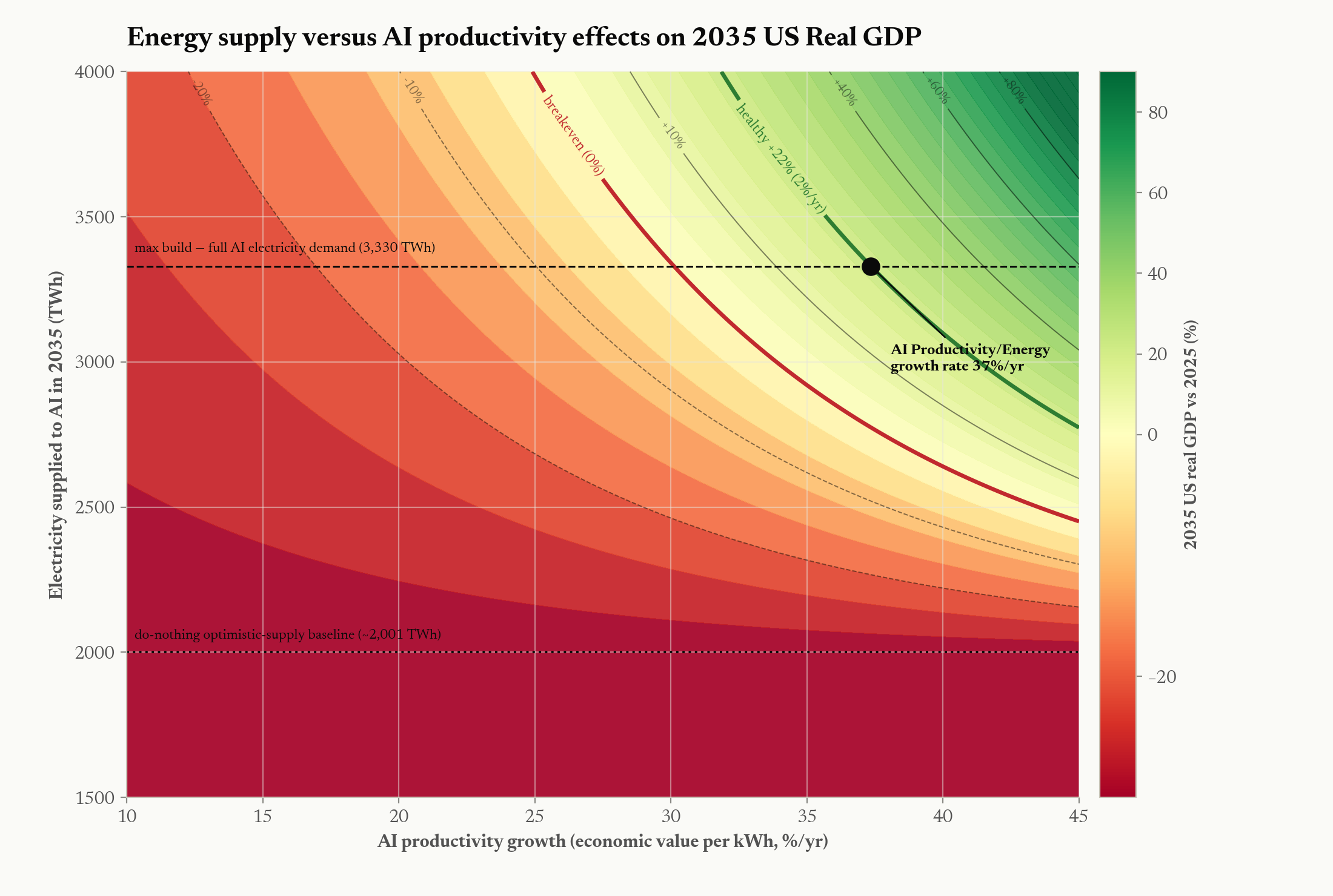
No calibration factors are applied. We report the direct output of the per-unit Lambert formula. It runs below Lambert's published index, but that gap is the aggregation-form difference documented in Appendix C (Figure C1) — a deterministic ≈1.45× on identical data, declining with the coal share, not a unit error — so calibrating to their numbers would be unjustified. Our form instead equals 1/(energy's share of GDP) and is validated against the observed EIA expenditure share; thresholds are derived on our own scale from observed outcomes (see below).
Empirical thresholds. Rather than adopt Lambert's original thresholds verbatim (which were derived on a different numerical scale), we derive our own from the 2022 European energy crisis—a natural experiment in which countries at measured LEROIS levels experienced quantifiable economic outcomes:
| Threshold | LEROIS | Empirical Basis |
|---|---|---|
| Comfortable surplus | >15:1 | US 2015–16: low cost pressure, strong growth |
| Industrial/economic functioning | 12–15:1 | US most years: normal operations |
| Emerging stress | 10–12:1 | US 2022 at 12.72: 9% inflation, no breakdown |
| Industrial strain | 8–10:1 | UK 2022 at 8.43: pension crisis, £40B subsidies |
| Deindustrialization | 7–8:1 | Germany 2022 at 7.29: BASF closures |
| Severe distress | <7:1 | France 2022 at 6.79: fiscal stress, social unrest |
5.2 Historical Series (2009–2024)
The historical LEROIS series is computed year-by-year from:
- GDP: World Bank national accounts (current USD)
- Energy mix: Our World in Data / Energy Institute Statistical Review (TWh by source, converted to MJ)
- Prices: End-user delivered prices from EIA (US), Eurostat (EU), IEA (international)
No calibration factors are applied. Values are the direct output of the Lambert formula using contemporary data sources—equivalently, the §5.1 model in its dormant regime (A = 1, K = 0, B ≈ 0), since realized GDP, TPES, and prices already embed any construction the system underwent.
End-user delivered prices—not commodity spot prices—are used throughout, consistent with Lambert's methodology. The delivered price includes transport, distribution, storage, and retail margins, reflecting the actual cost the economy pays for energy.
5.3 Supply-Demand Model
The forward-looking model ingests a 23-sheet Excel workbook containing:
- Project Ledger: 3,283 individual power generation projects with MW capacity, commercial operation date, development status, and modality classification
- DC Demand Ledger: 1,521 individual data center facilities with MW capacity, operational status, and expected online date
- 15 modality sheets: Detailed per-modality projections (geothermal, wind, solar+LDS, hydro, offshore, coal, diesel, reciprocating gas, aero gas, heavy gas, biomass, nuclear available, nuclear restart, nuclear new, SMR)
Each project's contribution to supply is computed as:
Where P(realization) ranges from 1.00 (operational) to 0.05 (MOU/LOI):
| Development Status | P(realization) |
|---|---|
| Operational | 1.00 |
| Under construction (>50%) | 0.90 |
| Under construction | 0.85 |
| Permitted/financed/contracted | 0.70 |
| Regulatory approved | 0.50 |
| Announced with site | 0.30 |
| Announced, no site | 0.10 |
| MOU/LOI | 0.05 |
Firm-equivalence factors account for the intermittency of renewable sources:
| Modality | Capacity Factor | Firm-Equivalence | Notes |
|---|---|---|---|
| CCGT (heavy gas) | 0.544 | 1.00 | Dispatchable baseline |
| Nuclear | 0.920 | 1.00 | Baseload |
| Coal | 0.395 | 1.00 | Dispatchable, declining |
| Geothermal (EGS) | 0.900 | 1.00 | Firm, baseload |
| Solar + LDS | 0.201 | 0.30 | Contested (NREL: 0.40–0.50; LBNL: 0.15–0.25) |
| Onshore Wind | 0.336 | 0.20 | Limited peak correlation |
| Offshore Wind | 0.420 | 0.25 | Minimal deployment through 2030 |
| Hydro | 0.400 | 0.85 | Dispatchable, water-year dependent |
The workbook provides supply and demand figures for the full 2024–2035 window directly; values for 2031–2035 are curve-fit extrapolations of the 2026–2030 bottom-up pipeline, computed within the workbook and ingested as-is.
5.4 Price Model and Energy-Cost Inputs
Baseline delivered prices. The price term uses end-user delivered prices—transport, distribution, storage, and retail margins included, reflecting the actual cost the economy pays—not commodity spot prices, consistent with Lambert's methodology. The forward baseline path extends the historical EIA delivered-price series used in the historical pipeline (EIA Annual Energy Outlook 2025 and Monthly Energy Review; end-user prices for international comparisons from Eurostat and the IEA). Starting points and the mild baseline cost trends are:
| Fuel | 2025 delivered price | 2035 (baseline trend) | Basis |
|---|---|---|---|
| Electricity | $139/MWh (≈13.9¢/kWh) | $187/MWh | EIA US average delivered/retail |
| Natural gas | $15.0/MMBtu | $20.0/MMBtu | EIA end-user delivered |
| Oil | $140/bbl | $158/bbl | EIA delivered (crude + refining + distribution) |
| Coal | $46/tonne | $50/tonne | EIA delivered to the power sector |
| Biomass | $190/tonne | $215/tonne | EIA / industry delivered |
These are real (constant-2025-dollar) trajectories: the mild escalation reflects real cost trends (grid buildout, more expensive marginal supply), not inflation, so they pair consistently with the real-GDP numerator. The five fuels and the energy-content factors that convert each to $/MJ (oil 6,120 MJ/bbl, gas 1,055 MJ/MMBtu, coal 24,000 MJ/tonne, electricity 3,600 MJ/MWh, biomass 18,000 MJ/tonne; EIA) are held fixed throughout.
Scarcity premium. On top of the baseline, each year's net-energy balance (supply growth + scenario additions − DC demand) drives a price premium through a short-run price elasticity of electricity demand of −0.3 (long-run ≈ −0.5; standard EIA/literature values), calibrated so that a ~10% supply shortfall reproduces roughly the ~40% price spike Germany experienced in 2022. The premium falls hardest on electricity and gas—the fuels AI demand bids on directly (gas takes ~60% of the electricity effect, oil ~30%, coal ~15%)—and is bounded by observed crisis peaks (Germany 2022: ≈$350/MWh electricity, ≈$45/MMBtu gas).
Price→GDP feedback. Energy is 6.5% of US GDP, so price moves feed back to output: we apply a sensitivity of −3% GDP per 100% rise in energy prices, measured relative to the do-nothing baseline prices. This makes the feedback deliberately asymmetric: because the reference is the Base Case's own (already-elevated) price path, the Base Case GDP is unchanged by its own high prices, and only differences from it move GDP — so the mobilization case's cheaper electricity ($114/MWh by 2035) lifts GDP modestly, while the Base Case's price pain is not double-charged against its GDP (the stress-scenario GDP path is taken to already embed it). The asymmetry is conservative for the Base Case (it does not add a further price-driven GDP hit) and is the reason the two scenarios' GDP paths differ only by the mobilization price delta. All price, elasticity, and crisis-bound constants are sourced and held fixed across scenarios.
5.5 LEROIS Projection
For each projected year (2025–2035) and each scenario:
- Start with 2024 baseline energy mix (coal: 8.3%, oil: 37.8%, gas: 34.2%, primary electricity: 17.7%, biofuel: 2.0%)
- Evolve mix forward: coal declines ~0.5 pp/yr, primary electricity increases ~0.9 pp/yr
- Apply scenario-specific prices from the price model
- Use the real-GDP baseline path in constant 2025 USD—the consensus path (+1.8%/yr; the stress-scenario ensemble path of §5.1 as downside variant)—with energy-price feedback measured relative to the do-nothing baseline prices; for the mobilization case, add the back-calculated AI value-add (ΔP·q) and subtract the capex-crowding drag
- Use TPES projections (EIA AEO 2025 baseline, ~0.8% annual growth), augmented by the buildout's embodied construction energy (B)
- Compute LEROIS using the Lambert formula directly (no calibration factor)
5.6 Scenarios
| Scenario | Description | Key Assumptions |
|---|---|---|
| Base Case | Announced projects only, probability-weighted; real-GDP numerator is the consensus path (+1.8%/yr, CBO/IMF-consistent), with the stress-scenario ensemble path (§5.1) reported as a downside variant | No intervention beyond the current pipeline. AI exists but is never powered at scale (incremental powered AI energy ΔP ≈ 0), so it earns ~none of the AI value-add—the costs land without the returns. |
| Nation-scale mobilization | Accelerated firm-supply buildout that powers AI at scale | Per-source additions (§3.3): geothermal ~800 TWh/yr (~100 GW), nuclear ~500 TWh/yr (~63 GW; SMR + restarts + new build), gas + SOFC ~500 TWh/yr (~80 GW); fusion excluded from 2035 delivery. AI value-add = ΔP·q with q₀ ≈ $0.50/kWh, reported as a g_Q band (25 / 35 / 45%/yr). A conservative half-speed-supply variant brackets buildout-ramp risk. |
5.7 Software and Reproducibility
The computational pipeline is implemented in Python as the analysis module. It reads directly from the workbook (xlsx format via openpyxl/pandas), applies zero hardcoded fallbacks, and produces all figures programmatically. Every constant is defined in a central config.py file. The pipeline is designed to be audit-ready.
python -m analysis                     # All scenarios, all figures (+ manhattan_eroi.xlsx)
python -m analysis --scenario baseline # Single scenario
python -m analysis --validate          # Validate workbook parsing
python -m analysis --output-json out.json  # Export all results
Data and code are available on request.
Appendix A: LEROIS Decomposition Analysis
What drives the J-Curve: price effect, mix effect, and GDP residual.
The Lambert formula decomposes into three independent drivers of LEROIS change: (1) the price effect—changes in delivered energy prices; (2) the mix effect—shifts in fuel mix composition; and (3) the GDP/energy residual—changes in economic intensity.
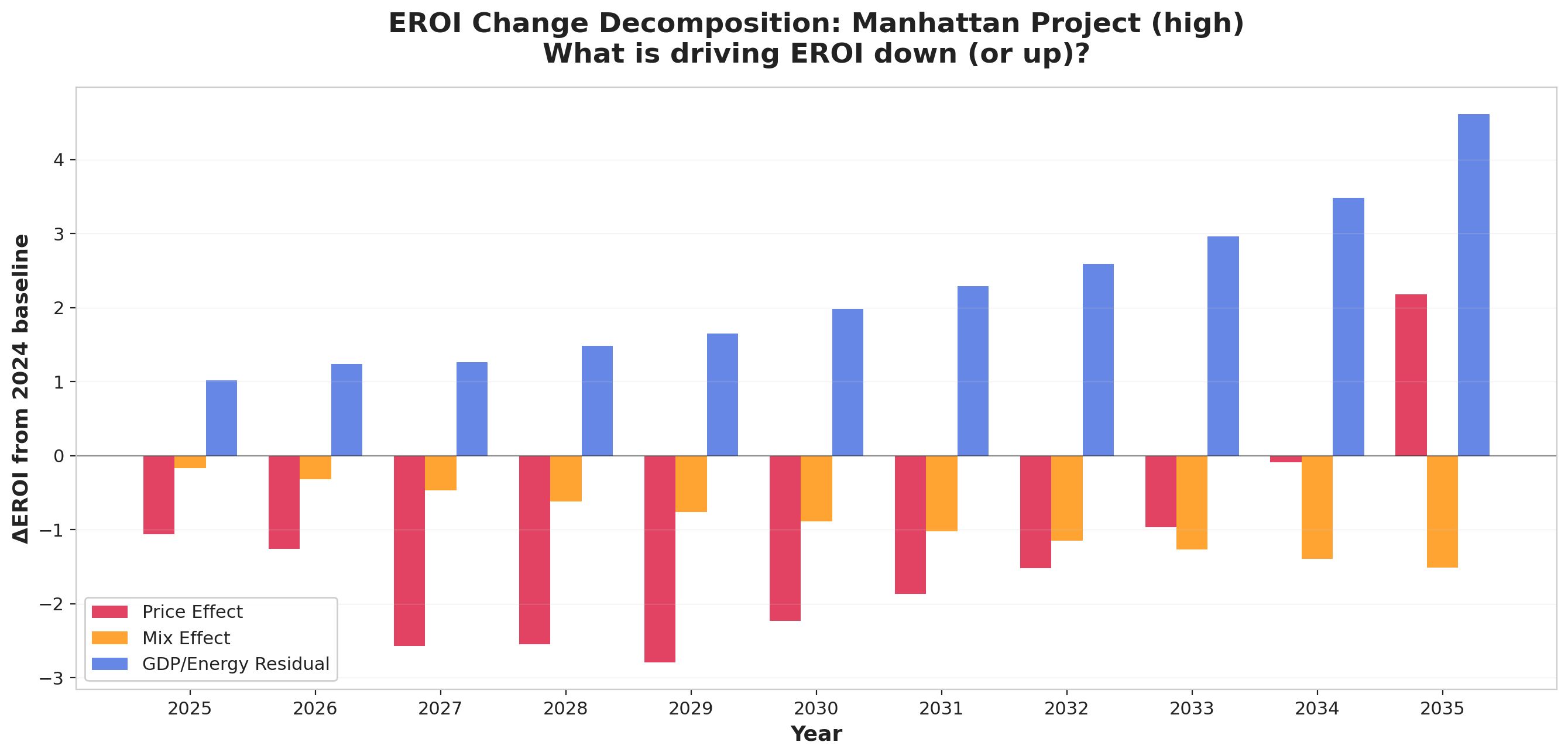
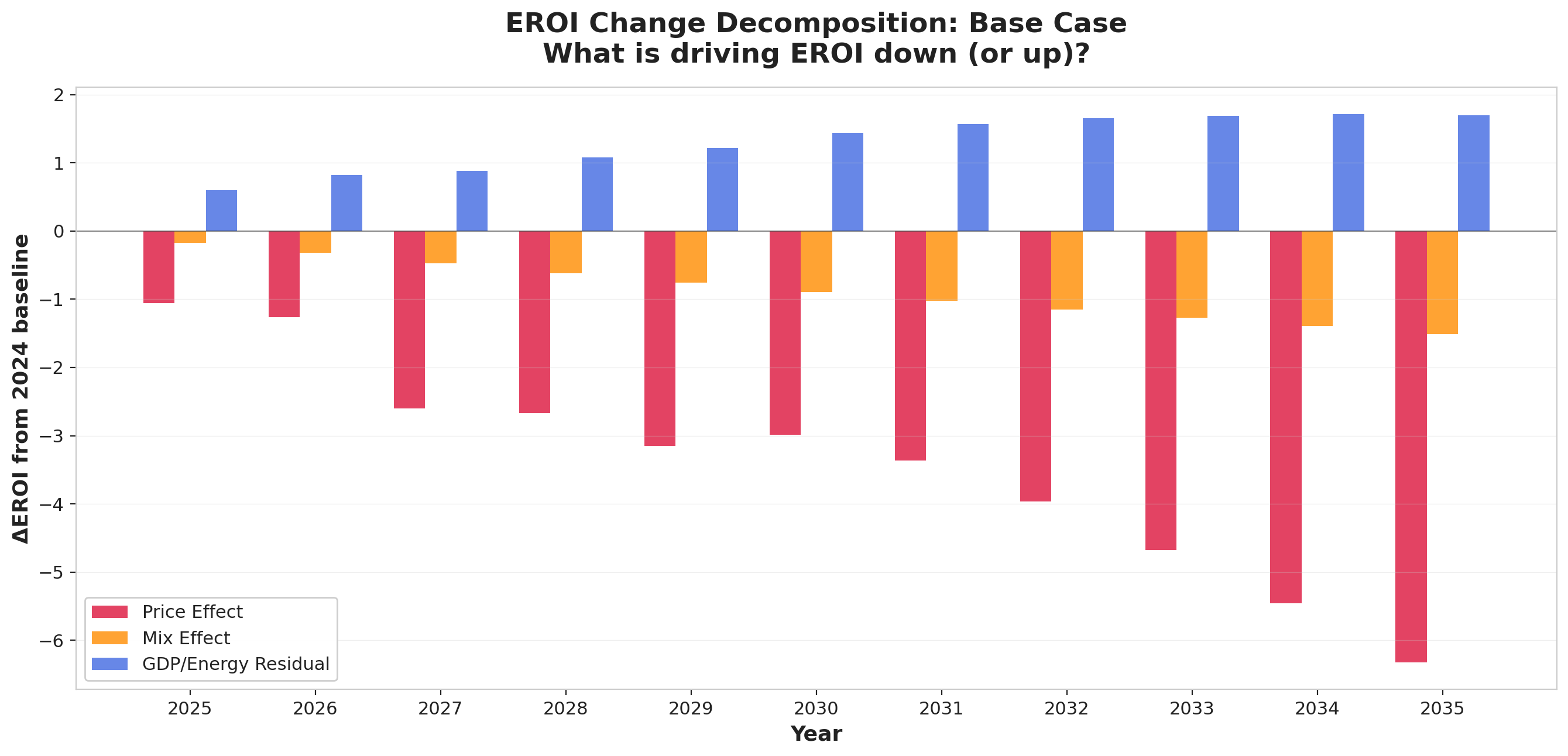
The decomposition reveals that:
-
Price effects dominate the descent: Rising energy prices account for the largest share of LEROIS decline through the trough—in the mobilization case the price effect reaches -2.2 points by the 2032 trough. But, unlike a naive "flood the market" picture, the recovery is not primarily a price story: the new supply brings electricity only back to roughly its 2024 level by 2035 (price effect ~+0.7, electricity ~$114/MWh versus the Base Case's ~$308/MWh), so the price term swings slightly positive rather than strongly so. In the Base Case the price effect deepens continuously to -6.4 points by 2035.
-
Mix effects contribute secondarily: The shift from cheaper fuels (coal, oil) toward more expensive primary electricity accounts for roughly -1.2 (2032) growing to -1.5 (2035) LEROIS points in both paths, as electrification raises the electricity share of TPES.
-
The recovery is driven by the GDP/AI-value residual: The residual—bundling the real-GDP path and the AI value-add (ΔP·q), net of the buildout's embodied energy (which enters E_T) and the crowding-out capex drag—swings from -3.2 at the 2032 trough to -0.3 by 2035 in the mobilization case, overcoming the near-neutral price effect and the negative mix effect to produce net recovery (+5.5 LEROIS points from trough to 2035, driven principally by this residual rather than by price relief). In the Base Case the residual stays only mildly positive (+0.7 by 2035): consensus real GDP keeps growing, but that modest tailwind comes nowhere near offsetting the -6.4 price effect, which carries essentially the entire -7.3-point decline. The slide is an energy-price story, not a GDP story.
Appendix B: UK LEROIS — A Skeptical Analysis
Our pipeline produces a UK LEROIS of 15.39 for 2024—which seems implausibly high given observable UK conditions (NHS in crisis, infrastructure decay, real wages stagnant since 2008, energy price cap required since 2022). Note that even in the crisis year of 2022, our pipeline produces UK LEROIS of 8.43—which does align with the observable industrial strain (see Appendix C). This appendix unpacks why the non-crisis values may overstate UK conditions.
B.1 What Produces the High Number
The Lambert formula for the UK in 2024:
- GDP: £2.72 trillion (~$3.4 trillion USD)
- TPES: ~7.0 EJ
- Mix: Gas-heavy (38%), oil (35%), primary electricity (20%), coal (3%), biofuel (4%)
- Prices: End-user delivered prices relatively moderate due to the energy price cap (suppressing the gas price signal)
The UK's relatively high GDP per unit of energy consumed (due to its service-heavy, low-manufacturing economy) produces a favorable first term (GDP/E_T). The UK simply does not use much energy per dollar of GDP because it does not manufacture much of anything. The second term (energy price index) benefits from the regulated price cap which holds consumer energy costs below market-clearing levels—but this is an artificial suppression, funded by taxpayer subsidy rather than genuine market abundance.
B.2 Why We Are Skeptical
-
The price cap is a fiscal transfer, not energy abundance: The UK's Energy Price Guarantee costs taxpayers approximately £40 billion. The Lambert formula sees low consumer prices and interprets them as favorable EROI. In reality, the energy is expensive but the cost is hidden in government debt. This is a measurement artifact: the formula measures delivered prices, not the true cost to society including the fiscal burden.
-
Service economy illusion: A country that imports its manufactured goods (steel from China, chemicals from Germany, electronics from Asia) does not account for the embodied energy of those imports in TPES. The UK's low energy intensity reflects outsourced manufacturing, not genuine efficiency. Adjusting for embodied energy in trade would substantially increase E_T.
-
Observable conditions contradict 15.39: On our scale, 15+ corresponds to "comfortable surplus" (anchored to US 2015–16). The UK's current reality—150,000+ NHS wait-list deaths above pre-pandemic baseline, 4% of bridges at "substandard" condition nationally (with hotspots above 15% in some councils), real wages flat since 2008, declining life expectancy in deprived areas—is inconsistent with a LEROIS in the comfortable surplus zone.
-
UK steel production has collapsed: From ~17.8 million tonnes in 1990 to roughly 4 million by 2024—the lowest output since the Great Depression—the UK has lost industrial capacity that the LEROIS metric would expect at higher values.
B.3 Assessment
We retain the UK LEROIS of 15.39 in our dataset as the mathematical output of the Lambert formula, but flag it as likely overstating the UK's true energy-socioeconomic position due to:
- Artificial price suppression via fiscal transfer (price cap)
- Embodied energy trade deficit not captured in TPES
- Service economy distortion of GDP/E_T ratio
A corrected estimate accounting for fiscal cost of the price cap (~£40bn added back to delivered prices) and estimated embodied energy of net imports (~2.5 EJ) would place UK LEROIS closer to 10–12:1, which is more consistent with observable conditions. Notably, the UK's crisis-year value (8.43 in 2022) does align well with observed outcomes—suggesting the Lambert formula works best when prices reflect true market costs rather than being distorted by fiscal transfers. Future work should develop a trade-adjusted LEROIS methodology.
Appendix C: Lambert Divergence and Threshold Derivation
C.1 Reconciling our scale with Lambert's published values
Our directly-computed series runs below Lambert's published societal-EROI numbers — for the US, by roughly half. The cause is the aggregation step, not the data and not a missing energy term. Lambert's Eq. 3 forms a ratio of two energy-share-weighted sums, mean energy content over mean price, (Σηᵢ E_Ui)/(Σηᵢ E_Pi); we compute the weighted average of each fuel's delivered cost per MJ, Σηᵢ (E_Pi/E_Ui). A ratio of means is not the mean of ratios; the two coincide only if every fuel had the same energy density, and fuels differ by four orders of magnitude (3.6 MJ/kWh for electricity vs 24,000 MJ/tonne for coal).
Applying Lambert's exact form to our own US data, year by year, isolates the effect (Figure C1, left): it raises the series by 1.28–1.64× (mean 1.45×) across 2009–2024, with the factor shrinking over time as coal — the fuel their form most over-weights — leaves the mix. The apparent ~2× gap to Lambert's published values is therefore this formula choice, reproduced deterministically on identical inputs; it is not an energy undercount and not a unit error to calibrate away.
We use the per-unit form for two reasons. It is unit-invariant (Lambert's ratio-of-sums shifts if coal is expressed in kg vs tonnes; ours does not — the "slippage" Murphy et al. (2011) caution against). And it telescopes to a checkable quantity, LEROIS = 1/(energy's share of GDP) (§5.1): 1/LEROIS equals 5.8–8.7% over 2009–2024 and tracks the EIA series for US energy expenditures as a share of GDP (Figure C1, right; e.g. 2015: ours 6.25% vs EIA 6.2%). Ours is thus the better-anchored estimator, and Lambert's published thresholds map onto our scale by dividing by ≈1.45.
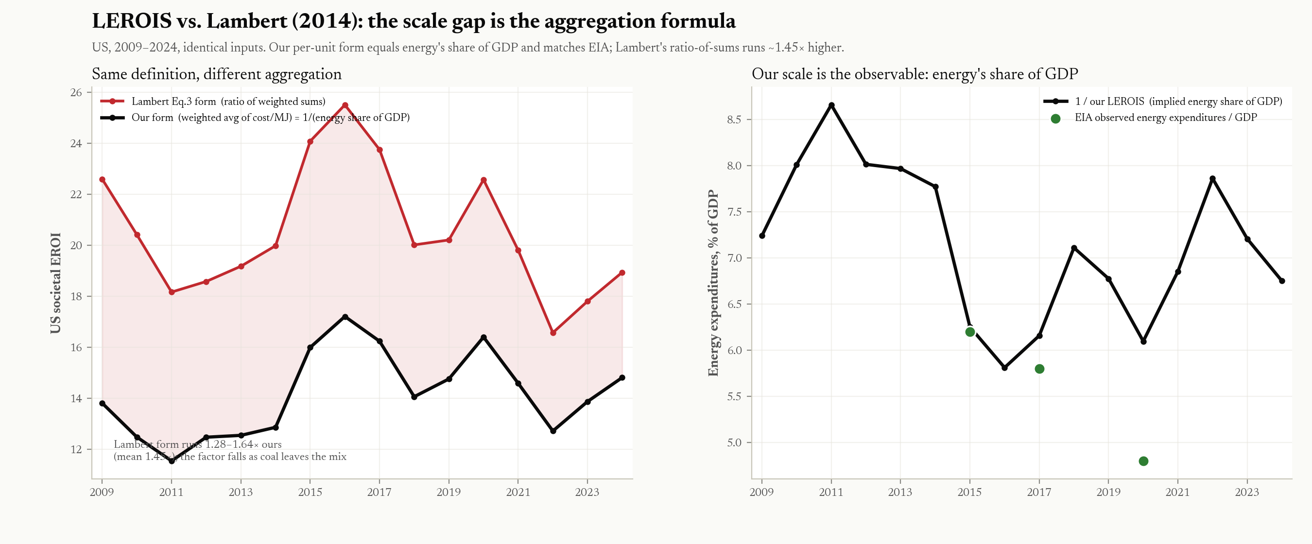
Two Lambert thresholds — only one is on our scale. Lambert et al. (2014) report two distinct EROI thresholds, and earlier drafts of this paper conflated them.
- (i) Their societal-EROI quality-of-life band — where HDI, health spending, female literacy, the Gender Inequality Index, and child nutrition rise steeply and then saturate — sits at ~20–30:1 on their (ratio-of-sums) scale. This is the same construct our LEROIS measures, so it is the comparable one; rescaled by the ÷≈1.45 aggregation factor it is ≈14–21:1 on our per-unit scale, bracketing our functioning floor of ~12–15.
- (ii) Their minimum-EROI "pyramid of energetic needs" (the figure of Lambert et al. (2012), EROI of Global Energy Resources (DFID report 59717), reproduced as Fig. 12 of the 2014 paper; concept after Hall, Balogh, and Murphy (2009)) places the EROI to sustain the full range of societal functions — transport, food, education, health care, the arts — at ~12–14:1. But that is a single-fuel extraction EROI (oil at the well-head), a different and lower-scale construct than the societal financial proxy; the two are not interchangeable, and Lambert et al. do not equate them. Its numerical closeness to our ~12–15 is coincidental, so we do not use it to calibrate our threshold.
Our functioning floor is anchored independently to the 2022 natural experiment (C.2); the rescaled societal-EROI band (i) corroborates it, while the pyramid (ii) does not bear on it.
Cross-country levels are not comparable; within-country trajectories are. Two of the effects above are country-specific: the aggregation factor depends on each nation's fuel mix (it is not a single constant), and the level is distorted wherever delivered prices are administered rather than market-clearing (China's prices; the UK price cap — Appendix B). Every result in this paper rests on within-country trajectories, where these biases cancel; we avoid cross-country level comparisons. (This supersedes the per-country "ratio to Lambert" table of earlier drafts, whose Lambert values could not be sourced — their paper plots country societal-EROI but does not tabulate it.)
C.2 Why We Derive Our Own Thresholds
Rather than calibrate our values to Lambert's scale and adopt their thresholds, we derive empirical thresholds directly from observed macroeconomic outcomes at measured LEROIS levels on our scale. The 2022 European energy crisis provides the natural experiment:
- US at 12.72: 9.1% CPI inflation, cost-of-living crisis, but no structural economic breakdown. The economy continued to function.
- UK at 8.43: Pension fund near-collapse requiring Bank of England emergency intervention. Energy Price Guarantee costing £40 billion in taxpayer subsidies. 11.1% inflation. NHS crisis deepening.
- Germany at 7.29: Active deindustrialization begins. BASF announced closure of European chemical operations. Energy-intensive manufacturing relocating permanently.
- France at 6.79: Fiscal stress, social unrest, industrial strain.
These outcomes are consistent with Lambert et al.'s core finding — that LEROIS levels correspond to economic and institutional function — while establishing the bands on our own numerical scale rather than by force-fitting. As Section 1.4 notes, the cross-section is small (a handful of countries, one year), so the bands are indicative rather than precise.
References
Acemoglu, D. (2024). The Simple Macroeconomics of AI. NBER Working Paper 32487.
Amodei, D. (2024). Machines of Loving Grace. darioamodei.com/essay/machines-of-loving-grace.
Aschenbrenner, L. (2024). Situational Awareness: The Decade Ahead. situational-awareness.ai.
Brockway, P. E., Owen, A., Brand-Correa, L. I., & Hardt, L. (2019). Estimation of global final-stage energy-return-on-investment for fossil fuels with comparison to renewable energy sources. Nature Energy, 4, 612–621.
Brynjolfsson, E., Rock, D., & Syverson, C. (2021). The Productivity J-Curve: How Intangibles Complement General Purpose Technologies. American Economic Journal: Macroeconomics, 13(1), 333–372 (NBER WP 25148).
Cleveland, C. J. (1992). Energy quality and energy surplus in the extraction of fossil fuels in the U.S. Ecological Economics, 6(2), 139–162.
Deloitte (2024). Nuclear energy could power the future of data centers. Deloitte Insights.
DOE (2023). Pathways to Commercial Liftoff: Advanced Nuclear. US Department of Energy.
DOE (2024). Pathways to Commercial Liftoff: Next-Generation Geothermal Power. US Department of Energy.
DOE (2024). U.S. Sets Targets to Triple Nuclear Energy Capacity by 2050. US Department of Energy, Office of Nuclear Energy.
Epoch AI (2025). Total Cost of Ownership of a One-Gigawatt AI Data Center. Epoch AI Data Insights.
EPRI (2024). Powering Intelligence: Analyzing Artificial Intelligence and Data Center Energy Consumption. Electric Power Research Institute.
IEA (2024). The Future of Geothermal Energy. International Energy Agency.
Goldman Sachs (2023). Generative AI Could Raise Global GDP by 7 Percent. Goldman Sachs Research.
Google DeepMind (2023). Scaling Deep Learning for Materials Discovery. Nature, 624, 80–85.
Hall, C. A. S., Balogh, S., & Murphy, D. J. R. (2009). What is the minimum EROI that a sustainable society must have? Energies, 2(1), 25–47. https://www.mdpi.com/1996-1073/2/1/25
Hall, C. A. S., Lambert, J. G., & Balogh, S. B. (2014). EROI of different fuels and the implications for society. Energy Policy, 64, 141–152.
Lambert, J. G., Hall, C. A. S., Balogh, S., et al. (2012). EROI of Global Energy Resources: Preliminary Status and Trends. UK Department for International Development (DFID), Report 59717. https://www.inist.org/library/2012-11-02.Lambert%20etal.EROI%20of%20Global%20Energy%20Resources.DFID-59717.pdf
Lambert, J. G., Hall, C. A. S., Balogh, S., Gupta, A., & Arnold, M. (2014). Energy, EROI and quality of life. Energy Policy, 64, 153–167.
McKinsey Global Institute (2023). The Economic Potential of Generative AI: The Next Productivity Frontier. McKinsey & Company.
Murphy, D. J., & Hall, C. A. S. (2010). Year in review—EROI or energy return on (energy) invested. Annals of the New York Academy of Sciences, 1185, 102–118.
Murphy, D. J., Hall, C. A. S., Dale, M., & Cleveland, C. (2011). Order from chaos: a preliminary protocol for determining the EROI of fuels. Sustainability, 3(10), 1888–1907.
Murphy, T. W. (2011). The Energy Trap. Do the Math (UCSD), 18 October 2011. dothemath.ucsd.edu/2011/10/the-energy-trap/.
Smil, V. (2017). Energy and Civilization: A History. MIT Press.
Weißbach, D., Ruprecht, G., Huke, A., Czerski, K., Gottlieb, S., & Hussein, A. (2013). Energy intensities, EROIs, and energy payback times of electricity generating power plants. Energy, 52, 210–221.